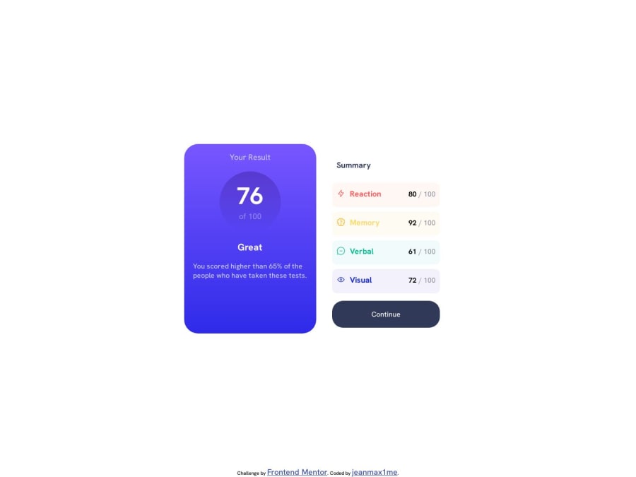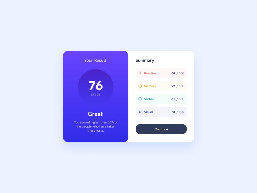
Design comparison
SolutionDesign
Solution retrospective
First time I do the 'mobile first' design, as I've read that it is the best practice. It was very hard for me took me the whole morning so maybe 4/5 hours in total for not so many lines of code but I had some classic issues with positionning, flex box, margins. I then added the desktop version and it was so much easier than I thought, with a simple media query. So this is a responsive page normally, not the greatest but I'm happy of my work. Also have not forgotten the hover effect for once hehe
Community feedback
Please log in to post a comment
Log in with GitHubJoin our Discord community
Join thousands of Frontend Mentor community members taking the challenges, sharing resources, helping each other, and chatting about all things front-end!
Join our Discord
