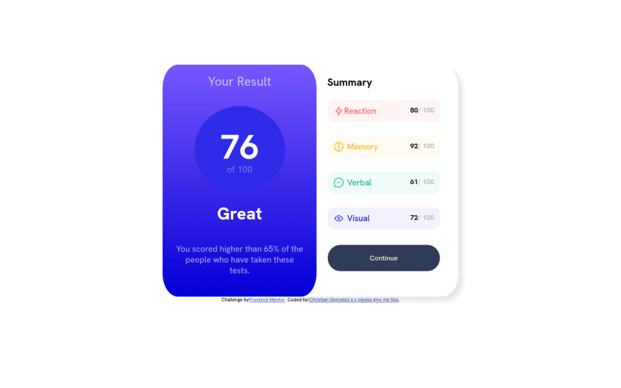
results-summary-component- Beginner HTML CSS
Design comparison
Solution retrospective
I'd like to know how I could have optimized this better I can definitely tell you now that I cut some corners!
Also, how could I use media quires to help make this responsive? I felt like I would have had to rewrite or restructure my code to make it work.
Any feedback is welcome, thank you!
Community feedback
- @Shiba-TatsuyaPosted over 1 year ago
A media query is a CSS technique used to apply different styles to a webpage based on the characteristics of the device or screen it is being viewed on. This allows developers to create responsive web design that adapts to the size, resolution, and orientation of the user's device, ensuring that the page looks and functions optimally on any screen. Media queries are defined using the @media rule in CSS. They consist of a media type (such as screen, print, or handheld), followed by one or more media features that describe the characteristics of the device, such as its width, height, orientation, resolution, and color. You can find about it more here : https://developer.mozilla.org/en-US/docs/Web/CSS/Media_Queries/Using_media_queries
and use ''alt'' attribute in img tag. It is an important attribute because it serves as a fallback option in case the image cannot be displayed. The text provided in the alt attribute is also useful for people using screen readers or with images disabled in their web browser. Keep Building Projects 👍
0
Please log in to post a comment
Log in with GitHubJoin our Discord community
Join thousands of Frontend Mentor community members taking the challenges, sharing resources, helping each other, and chatting about all things front-end!
Join our Discord
