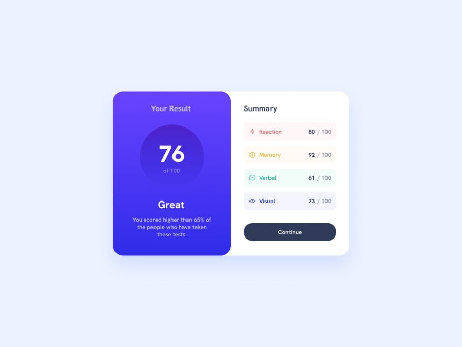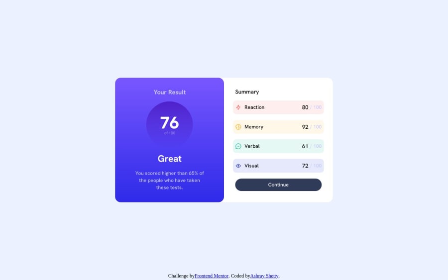
Design comparison
SolutionDesign
Solution retrospective
I have not added mobile view. I feel like I have been improving and getting used to the CSS. Any constructive criticism is welcome.
Community feedback
- @lack21Posted over 1 year ago
Good work 👍, but I have some recommendations!
- Remove
width: 100vw
from the class.master
, it's the block level element which by default takes the full space, so there's no need forwidth: 100vw
. - Replace
height: 100vh
tomin-height: 100vh
in the class.master
, the difference is that, when you setheight: 100vh
to something, that means it won't be bigger than that, it might cause some problems in the future, so better approach is to setmin-height: 100vh
, like this in case content is overflowing container will adjust to it. - Remove
flex-direction: row
from the class.card
and.master
, when you setdisplay: flex
by default flex-direction is row, so it does nothing here.
0 - Remove
Please log in to post a comment
Log in with GitHubJoin our Discord community
Join thousands of Frontend Mentor community members taking the challenges, sharing resources, helping each other, and chatting about all things front-end!
Join our Discord