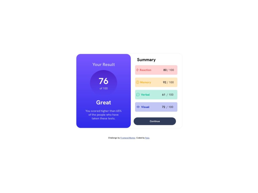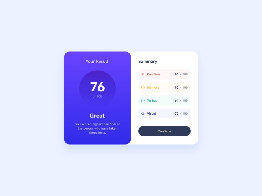
Design comparison
Community feedback
- @owlbuntPosted about 1 year ago
Hey! Everything is alright, but I found some issues you can improve to make it better:
1 Always create your CSS file inside the assets folder to keep your code clean.
2 You don't need to import fonts as they are already in the assets/fonts/static folder. You can use that font, or if you're importing a font, it's best to download and use it.
3 There are some responsive issues on mobile devices; desktop devices are fine. Try using 100dvh instead of 100vh, and the same goes for width too. Thanks,
Mark this as useful if it helps.
0
Please log in to post a comment
Log in with GitHubJoin our Discord community
Join thousands of Frontend Mentor community members taking the challenges, sharing resources, helping each other, and chatting about all things front-end!
Join our Discord
