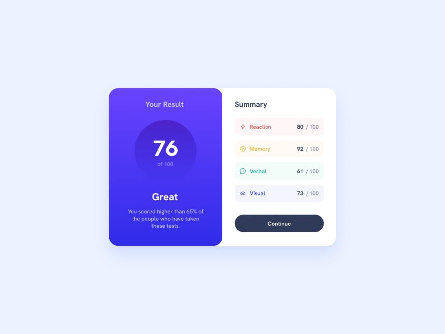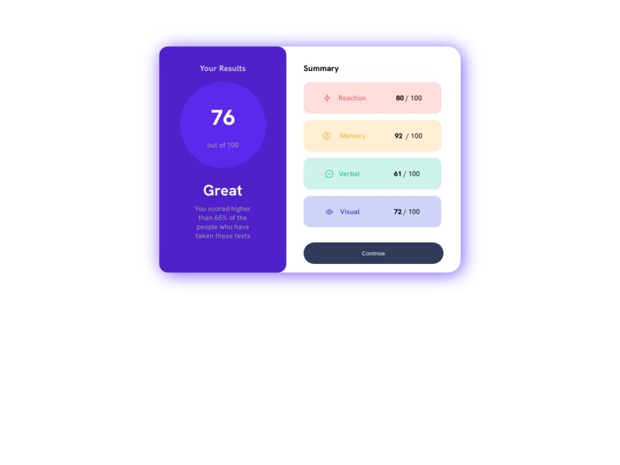
Design comparison
Solution retrospective
still unsure with best practice css and javascript. i try to add json in project and some DOM. please be kind to give me feedback. thankyou
Community feedback
- @T-O-R-U-SPosted over 1 year ago
- Gradient Radience!
Pro tip: You can replicate the background gradient in the final score panel using a CSS gradient :)
.my-awesome-gradient { /* The first parameter indicates the directionality of the gradient, measured in degrees (as in angles). * Here, we use 180˚ to make our gradient point straight down. <from this colour> will be at the top, * <to this different one> will be at the bottom. */ background-image: linear-gradient(180deg, <from this colour>, <to this different one>) }
In this specific example, you can use the following CSS rule for the background:
background-image: linear-gradient(180deg, hsla(256deg, 72%, 46%, 1), hsla(241deg, 72%, 46%, 0))
- Did you know that you can use CSS variables to make reused values easier to read?
body { /* Always prefix your CSS variables with two hyphens 👌 */ --my-cool-colour: hsla(241, 72%, 46%, 0); /* Variables can store many properties; I recommend you visit the MDN web docs to find out * just what they are capable of */ --my-cool-font-size: 5000000px; /* My users will have no problem reading this! */ } #part-of-the-body { /* The variable --my-cool-colour has been inherited from the body, and can now be reused across all elements! */ /* Make sure to use the var() function to access variables */ background-color: var(--my-cool-colour) }
This feature is particularly helpful when porting over colours and sizes from the
style-guide.md
file, as it means that you don't need to constantly reference it.- Style guidance!
As has already been stated by another helpful commenter, also make sure to use the
style-guide.md
; it has a variety of helpful information about the design we're trying to reconstruct.Good luck! :)
1 - @REFH4CKPosted over 1 year ago
Greetings, I hope you are well friend! I would recommend you let yourself be carried away by the style guide that comes in the project folder there you are provided:
- Color palette
- Google Fonts link
- Font size On the other hand, you also have the "Design" folder where you have a clear guide on how the design should be adjusted.
And you should not worry, little by little you will improve and learn the best practices of CSS and JS friend!
Recommendation: Work in separate files :D it will make your life easier and you will be able to work in a more orderly way, so you can move between files and directories in the best possible way and use semantic tags for your HTML structure:
- <main>, <footer>, etc..
1
Please log in to post a comment
Log in with GitHubJoin our Discord community
Join thousands of Frontend Mentor community members taking the challenges, sharing resources, helping each other, and chatting about all things front-end!
Join our Discord