Submitted about 2 years ago
Results Summary with Tailwind
#accessibility#tailwind-css
@pRicard0
Design comparison
SolutionDesign
Solution retrospective
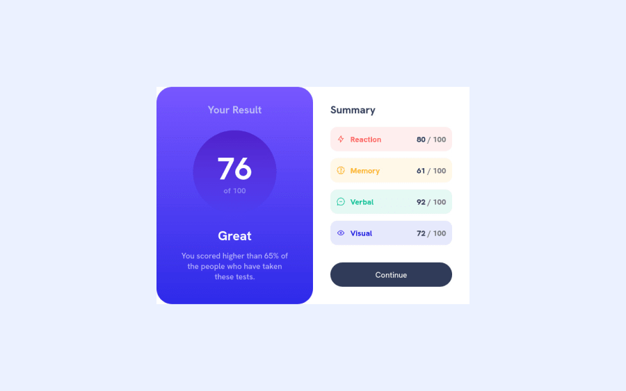
In this project I started making the mobile first, it was much easier. I had an idea of putting a transition on the button's color change but I haven't figured out how to do that yet.
Any feedback is welcome.
Community feedback
Please log in to post a comment
Log in with GitHubJoin our Discord community
Join thousands of Frontend Mentor community members taking the challenges, sharing resources, helping each other, and chatting about all things front-end!
Join our Discord
