Design comparison
Solution retrospective
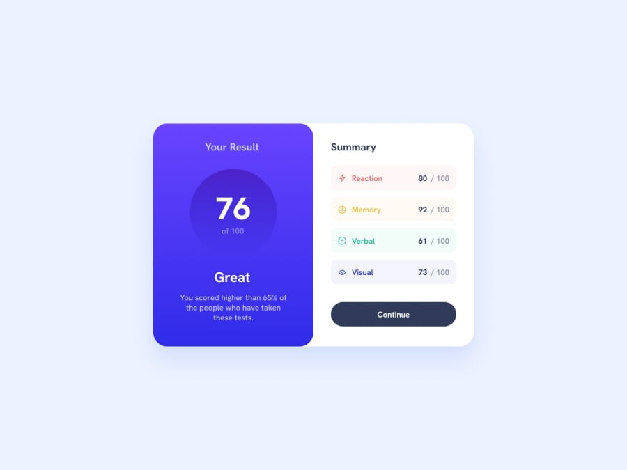
i found it quite difficult to properly round off the borders of each component in results. the media query was a pain. also could not overlap the right box onto the left i tried using the shadowing to create that illusion. lastley idk if its cause this is a newb project but the media query only works on mobile its not optimised to tablets and ipads...which i intend to run into in future.
Community feedback
- @timavidonPosted over 1 year ago
I recommend putting the left-card and right-card divs inside a div (or something semantic like section or article). In my opinion, this will help you layout more easily with flex or gird.
For the button, I recommend doing
border-radius: 100vw; so you don’t have to guess the right number to make it round.For the summary items, I recommend using rems instead of % in the border-radius. something like
border-radius: 0.5rem;. in general its better to use rems for margins, padding, font-size. It's okay to use 50% for the border-radius like you did for the cirlce 👍For the circle, I recommend doing a width of 12.5rem and height 12.5rem, instead of height (you can also do
aspect-ratio: 1 / 1;, it will set the height like the width that you set). To center the circle I recommend doing margin-inline: auto (it will set the margins on the sides to auto).Overall, you still did a good job. I am sure that in the future you will be able to do it more professionally as you want.
Marked as helpful1@CheFernandez99Posted over 1 year ago@timavidon hey Tim thanks for the feedback, my divs are in a section. But thanks for the advice I will use it in future projects👍
0 - @CheFernandez99Posted over 1 year ago
i noticed after i uploaded the project that the button went outside the box this is likely due to margins.
0
Please log in to post a comment
Log in with GitHubJoin our Discord community
Join thousands of Frontend Mentor community members taking the challenges, sharing resources, helping each other, and chatting about all things front-end!
Join our Discord
