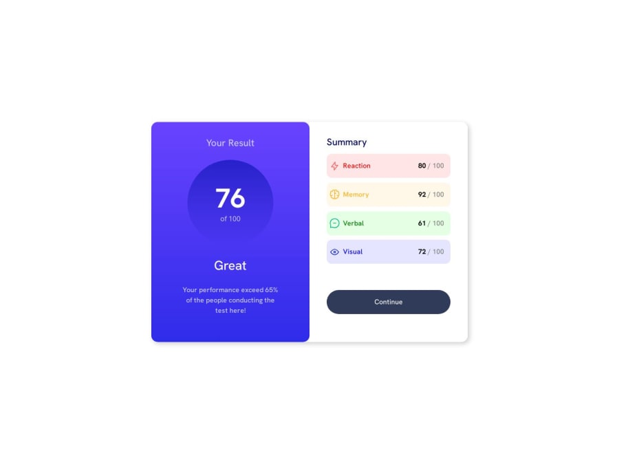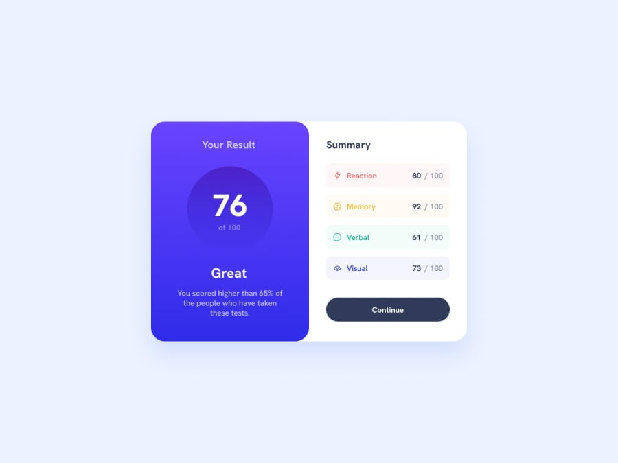
Design comparison
Solution retrospective
I'm particularly proud of the responsiveness of this page and it was good to reintroduce myself to css. I would potentially use sass or tailwind in future projects.
What challenges did you encounter, and how did you overcome them?I only had a few challenges. Initially the switch to mobile gave me some issues until I understood the @media concepts in css. I also had some issues with github pages, in particular the image basepaths but thankfully I worked these out looking online.
What specific areas of your project would you like help with?I'm happy with my project as it is.
Community feedback
- @Chermann-KINGPosted 4 months ago
Hi @Ropenfold,
I took the time to look at the code of your solution and I did the test, I think you did a good job. The only thing I can point out is your style management (borders, colors, shadows) compared to the model but really nothing very objective or blocking.
Well done ;)
Marked as helpful1
Please log in to post a comment
Log in with GitHubJoin our Discord community
Join thousands of Frontend Mentor community members taking the challenges, sharing resources, helping each other, and chatting about all things front-end!
Join our Discord
