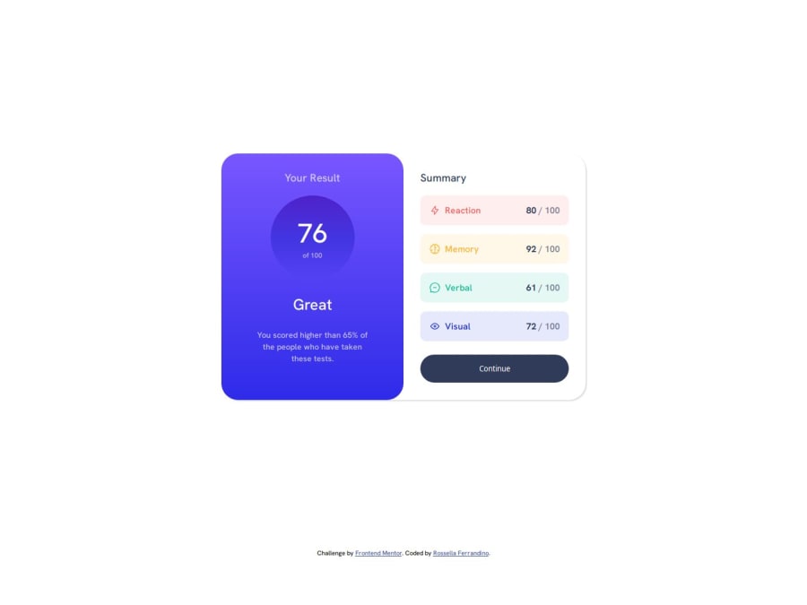
Not Found
Not Found
Not Found
Not Found
Not Found
Not Found
Not Found
Not Found
Not Found
Not Found
Not Found
Not Found
Not Found
Not Found
Not Found
Not Found
Not Found
Not Found
Not Found
Not Found

Submitted

Results summary using HTML/CSS/JS

@RossellaFer

Desktop design screenshot for the Results summary component coding challenge

This is a solution for...

  • HTML
  • CSS
1newbie
View challenge

Design comparison


SolutionDesign

Solution retrospective


What are you most proud of, and what would you do differently next time?

I planned the HTML beforehand, thinking about the semantic elements that could be used for the different sections of the design.

Next time I would try out a CSS framework, or extend the design with some micro interactions on hover.

What challenges did you encounter, and how did you overcome them?

Getting the colors right without the use of Figma

What specific areas of your project would you like help with?

  1. What semantic elements would you use for this layout? I chose because it is meant for a reusable component.
  2. What do you think about the CSS organization? I tried to have the more general rules at the top and then move on to the elements top to bottom

Community feedback

Shaurya Guptaβ€’ 100

@madebyshaurya

Posted

Hi, I wanted to say that if you were having trouble with colours, you can use the "style-guide" file included in every frontend mentor project. The style guide has specific colours which you can copy-paste in your website.

If you found this useful please upvote this comment, thanks.

1
Abdul Khaliq πŸš€β€’ 72,620

@0xabdulkhaliq

Posted

Hello there πŸ‘‹. Congratulations on successfully completing the challenge! πŸŽ‰

  • I have a suggestion regarding your code that I believe will be of great interest to you.

MOBILE FIRST WORKFLOW πŸ“² :

  • Your CSS layout skills are impressive! To refine them further, I suggest trying out a mobile-first workflow.
  • This approach starts with designing for mobile devices, which not only caters to the increasing number of mobile users but also helps in creating more responsive and efficient layouts.
  • It's like putting your users first and ensuring they have a great experience no matter what device they're using.
  • Incorporating a mobile-first approach into your workflow not only enhances your skills but also ensures your designs are future-proof and user-friendly. Keep up the great work!

.

I hope you find this helpful πŸ˜„ Above all, the solution you submitted is great !

Happy coding!

0

Please log in to post a comment

Log in with GitHub
Discord logo

Join our Discord community

Join thousands of Frontend Mentor community members taking the challenges, sharing resources, helping each other, and chatting about all things front-end!

Join our Discord