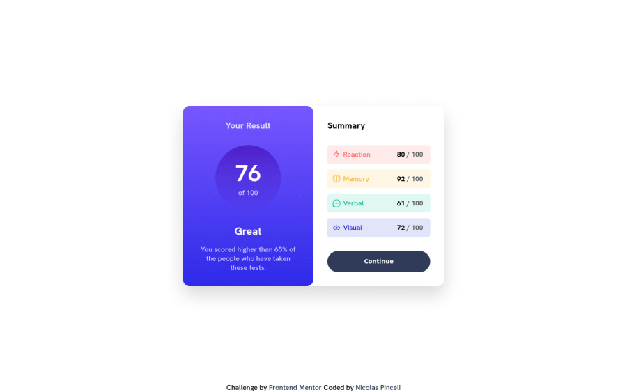
Design comparison
Solution retrospective
It's not responsive for mobile yet, I'm still learning how can I do this.
Fell free to give me some tips
Community feedback
- @Shiba-TatsuyaPosted over 1 year ago
use @media query. A media query is a CSS technique used to apply different styles to a webpage based on the characteristics of the device or screen it is being viewed on. This allows developers to create responsive web design that adapts to the size, resolution, and orientation of the user's device, ensuring that the page looks and functions optimally on any screen. Media queries are defined using the @media rule in CSS. They consist of a media type (such as screen, print, or handheld), followed by one or more media features that describe the characteristics of the device, such as its width, height, orientation, resolution, and color. You can find about it more here : https://developer.mozilla.org/en-US/docs/Web/CSS/Media_Queries/Using_media_queries
Marked as helpful1 - @visualdennissPosted over 1 year ago
Great job in completing the challenge! Looks really nice.
For responsiveness, you can add flex-direction to column like this for mobile
main { flex-direction: column; }
and remove the following widths so it is 100% again :
main .left-content { width: 50%; } main .right-content { width: 50%; }
Hope you find this helpful!
Marked as helpful1
Please log in to post a comment
Log in with GitHubJoin our Discord community
Join thousands of Frontend Mentor community members taking the challenges, sharing resources, helping each other, and chatting about all things front-end!
Join our Discord
