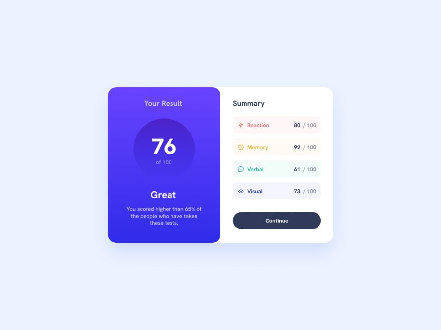
Design comparison
Solution retrospective
I am so excited to present this solutuion to the community and am happy that i have finished it. i am so proud of how i was able to use linear gradient for the first time and get that look like the design given
What challenges did you encounter, and how did you overcome them?The challenges i faced were paragraphs getting out of div and i overcame them by hiding the overflow. another challenge was on the circle about how to get the exact look like the given challenge where again the numbers were getting out of div but i overcame by using block display
What specific areas of your project would you like help with?I need more help on the challenges chat occur to paragraph due to some automatic CSS that are already found in the website. example the padding of the paragraphs. Again I am open for any comments and maybe what should I improve to be mere competent for the next project. Thank you!!
Community feedback
- @dylan-dot-cPosted about 1 year ago
Good job here.
It's not responsive for mobile devices tho...
Sometimes it's recommended to use mobile first as it's easy to scale from small to large and not the other way around...
In this case you would need media queries to help with that
I've realized the div is not perfectly centered.
You can use better naming conventions for your CSS classes as some are confusing and can be misleading.
Mainly focus on responsive design, flex or grid for centering.
0
Please log in to post a comment
Log in with GitHubJoin our Discord community
Join thousands of Frontend Mentor community members taking the challenges, sharing resources, helping each other, and chatting about all things front-end!
Join our Discord
