

Design comparison

Solution retrospective
learned about custom properties and utility classes try to do it faster
What challenges did you encounter, and how did you overcome them?the entire challenge was the challenging part for me because I took away the responsiveness when I tried to style both divs really badly, so I started from scratch twice because it was easier for me instead of trying to fix it.
I also watched one of kevin powels' frontend mentor series and learned to use custom properties and make utility classes.
What specific areas of your project would you like help with?for the html, if I were to write semantic html would I need a header for this or would i be fine with just a main?
is my css easy to read when it comes to naming custom properties and classes? If not is there a better way to name them?
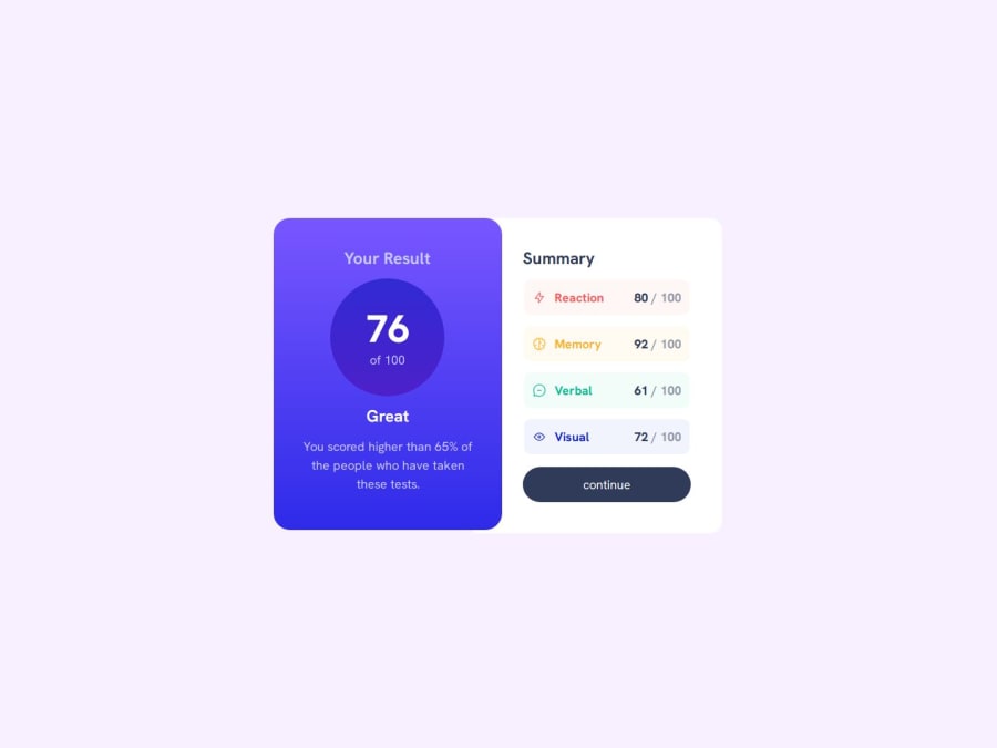
For the mobile design should I limit the width of the summary div to stop the table rows and button from stretching? if so how would I do it?
Community feedback
- @0xabdulkhaliqPosted 12 months ago
Hello there 👋. Congratulations on successfully completing the challenge! 🎉
- I have a suggestion regarding your code that I believe will be of great interest to you.
CSS 🎨:
- Looks like the component
buttonhover state background has not been set yet.
- Just add the following Tailwind utility classes for the
buttonelement
hover:bg-gradient-to-r from-purple-600 to-indigo-600- Example,
<button class="button | bg-primary-500 text-neutral-100 hover:bg-gradient-to-r from-purple-600 to-indigo-600">
    Continue
</button>
- Now your component's
buttonbackground for hover state has been set properly
.
I hope you find this helpful 😄 Above all, the solution you submitted is great !
Happy coding!
Marked as helpful0 - @R3ygoskiPosted 12 months ago
Hello Nathan, first of all, congratulations on your project, it's really impressive.
Regarding your HTML question, just using a
<main>tag would suffice. This is because your content doesn't precisely have a section that can be considered a header.As for your second question, the way you've utilized custom properties is extremely intriguing. Did you draw inspiration from Tailwind, by any chance? Well, the tip I have for you is to consider using BEM. I'm not sure if it would fit seamlessly with the utility-first approach you've adopted, but it's worth experimenting. However, I understand it might make the workflow a bit more intricate, right? Perhaps it's best to either stick with BEM and a preprocessor or explore a CSS framework like Tailwind.
Regarding your third question, I would say yes. The buttons are shrinking too much, causing them to break on screens as small as 320px. It would be ideal to set a limit close to this breakpoint.
Once again, congratulations on completing your project! The utility-first approach you've employed is quite intriguing, and the way you've organized your HTML (class | util) is particularly clever. If anything I've mentioned isn't clear, please feel free to comment below.
0@tatsuya98Posted 12 months ago@R3ygoski
for the custom properties I named the same way that kevin powell did when I was watching one of his frontend mentor build series so I'm not sure where naming style comes from.for the HTML (class | util) that also was from the series. he said uses it to seperate his compnent classes from his custom.
For the setting the limit on the div what size would you recommend?
0@R3ygoskiPosted 12 months ago@tatsuya98 For the min width size, I would recommend 200px, but before this, you need to change something, like, you summary need to have this properties
display: flex;andalign-items: center;, and finally in yourtrjust setmin-width: 200px.If something is unclear well, you know, just ask here and I will try to help in best possible way. And if my comment was helpful, please mark it as helpful, because it's help me a lot.
Marked as helpful0@tatsuya98Posted 12 months ago@R3ygoski thanks for your help. I know now that I can use min-width to prevent elements from shrinking too much.
1


Please log in to post a comment
Log in with GitHubJoin our Discord community
Join thousands of Frontend Mentor community members taking the challenges, sharing resources, helping each other, and chatting about all things front-end!
Join our Discord