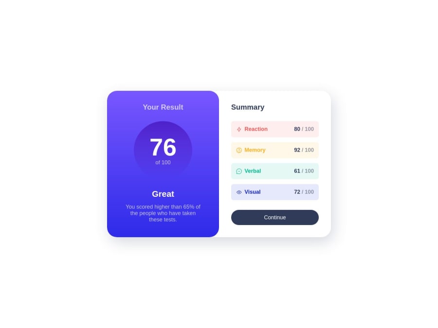
Results Summary using CSS grid and flexbox
Design comparison
Solution retrospective
This is quiet difficult for a newbie like me, so i took help from Kevin Powell through his video.If you want to watch, Link : https://youtu.be/KqFAs5d3Yl8?si=TMzx-P9JPAnRvyJ3
Community feedback
- @danielmrz-devPosted 11 months ago
Hello @ksbr0000!
Your solution looks excelent!
I have just one suggestion:
- For semantic reasons, only use one
<h1>per page - it should represent the main heading/subject for the whole page. The headings (h1 to h6) are recommended for titles, but unlike what most people think, it's not just about the size and weight of the text.
The
<h1>to<h6>tags are used to define HTML headings.<h1>defines the most important heading.<h6>defines the least important heading. And don't skip heading levels - start with<h1>, then use<h2>, and so on.This change has little or not effect at all on the project, but it makes your HTML code more semantic, improving SEO optimization as well as the accessibility of your project.
I hope it helps!
Other than that, you did a great job!
Marked as helpful0 - For semantic reasons, only use one
Please log in to post a comment
Log in with GitHubJoin our Discord community
Join thousands of Frontend Mentor community members taking the challenges, sharing resources, helping each other, and chatting about all things front-end!
Join our Discord
