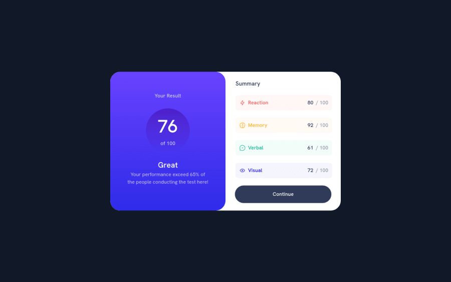
Design comparison
Solution retrospective
This is my first project after switching from CRA and Material-UI to Astro and Tailwind-CSS.
If anyone is familiar with these frameworks and has any tips or tricks or general advice you wish you had when starting out.
Also any suggestions for making the code more accessible that would be much appreciated.
Community feedback
- @ApplePieGiraffePosted over 1 year ago
Hey there, Dawid Keyser! π
Good work on this challenge! π
I haven't used Tailwind or Astro before, so I'm afraid I can't offer you much help with that, but I have one or two other small tips for you. π
Instead of adding a fixed width to the card in the mobile layout, I would suggest giving it
width: 100%
and then adding a max-width to it to prevent it from becoming too wide. This way, the card component should adjust to the viewport width (and not cause any overflow) on smaller screen sizes.Also, I would leave the
alt
text for the icons in this card empty since they aren't important for the content of the card and don't need to be noticed and read by screen readers. πHope you find these tips helpful. π
Keep coding (and happy coding, too)! π
Marked as helpful0@dawkey95Posted over 1 year ago@ApplePieGiraffe I will look at implementing that into my next project thank you for the advice π¦happy coding.
1@dawkey95Posted over 1 year ago@ApplePieGiraffe Hey when you work with breakpoints in the context of what you said with w-100% how do you implement the breakpoints for different screen sizes? It has been a few years and getting tripped up with max-width min-width etc.
Mind just helping me wrap my head?
1@ApplePieGiraffePosted over 1 year ago@dawkey95
I try to create most responsive layouts with just two media queries if I can so that I have mobile, tablet, and desktop styles. So maybe something like this:
.card { width: 100%; max-width: 30rem; @media (min-width: 768px) { max-width: 40rem; } @media (min-width: 1110px) { max-width: 50rem; } }
That's just a quick example, it really depends on what kind of design you are working with and how the layout changes.
I'd recommend checking out the code for any high-quality projects you find on here and seeing how other people approached certain layouts or challenges. It'll give you ideas and help you write and reason about your own code. π
Marked as helpful0@dawkey95Posted over 1 year ago@ApplePieGiraffe awesome thanks. I am currently working on the Skilled E-Learning Challenge and having bit of struggle with the hero background image size/positioning but I guess it is part of the experience and learning π
thanks for the input and advise
1@ApplePieGiraffePosted over 1 year ago@dawkey95
No problem! π
The layout of the hero section in the Skilled E-learning challenge can be tricky! π
Here's a solution I completed some time ago with a similar hero section design (e.g., image on the left that overflows the viewport) if you'd like to check it out for any ideas. π
Keep practicing and with time you'll find better and better solutions to layout problems. π
Marked as helpful0
Please log in to post a comment
Log in with GitHubJoin our Discord community
Join thousands of Frontend Mentor community members taking the challenges, sharing resources, helping each other, and chatting about all things front-end!
Join our Discord