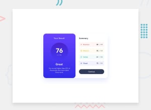
Design comparison
Community feedback
- @sefaonderPosted 9 months ago
Hello @Christener19 thank you for sharing your solution with us.
I really like your design, but I have a few suggestions to upgrade your code:
1.In the design template, we are given HSL colors. You can use HSL to make them more transparent, for example:
hsla(39, 100%, 56%,0.1). I see that you use rgba in the code, which is also an alternative. You can also use the:rootselector to color the colors. You can use it withvar(). For more please check out CSS :root Selector2.Instead of using a single color on the button, you can give it a hover effect. This improves the user experience. For more information check out Button Animation & Hover
3.A light box shadow was used in the original design. You can find detailed information about box-shadow here CSS box-shadow. You can also use some tools to make the work easier with box-shadow.
4.Finally, I recommend that you use the rem unit instead of the px unit. You can find detailed information about this here px or REM
Marked as helpful0@Christener19Posted 9 months ago@sefaonder
Hello Sefa,
Thank you for your comment! I wondered what desktop and desktop active meant and wondered why they were different - the penny has dropped now 😂. I've followed your advice and added a hover effect. I also overlooked the box-shadow 😅.
Again, I am really grateful for your advice - I don't want to fall into a habit of bad habits!
All the best, Christener
0
Please log in to post a comment
Log in with GitHubJoin our Discord community
Join thousands of Frontend Mentor community members taking the challenges, sharing resources, helping each other, and chatting about all things front-end!
Join our Discord
