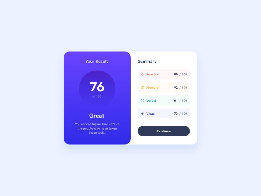
Design comparison
Solution retrospective
Faced lot of difficulties for this solution, saw lot of tutorials and took help of availabilities. Feel free to suggest and give feedback.
Community feedback
- P@danielmrz-devPosted about 1 year ago
Hello @Asrithareddy19!
Your solution looks excelent!
I have just one suggestion:
📌 Consider this tweak for your HTML code:
To improve semantic clarity, try maintaining the titles hierarchy with
<h1>,<h2><h3>, and so on.It's more than just text size — it's about structuring your content effectively:
<h1>to<h6>are used to define HTML headings, with<h1>being the most significant.- And stick to one
<h1>per page for the main title.
While these adjustments might not alter the visual appearance much, they significantly enhance semantic clarity, SEO optimization, and accessibility.
Hope this suggestion proves helpful! Keep up the great work!
Marked as helpful0 - @Ezekiel225Posted about 1 year ago
Hello there 👋 @Asrithareddy19.
Good job on completing the challenge !
Your project looks really good!
I have a suggestion about your code that might interest you.
There is an very useful browser extension called Perfect Pixel that allow you compare with the design image and thus see the exact dimensions. I recommend it to you.
Use <main> to wrap the main content instead of <div>.
📌 Tags like <div> and <span> are typical examples of non-semantic HTML elements. They serve only as content holders but give no indication as to what type of content they contain or what role that content plays on the page. This tag change does not impact your project visually and makes your HTML code more semantic, improving SEO optimization as well as the accessibility of your project.
I hope this suggestion is useful for future projects.
Keep up the excellent work and continue to challenge yourself with new projects. Your progress is impressive, and each project is a step forward in your front-end development journey! 🚀🌟.
Other than that, great job!
Happy coding.
Marked as helpful0 - @aymenthedeveloperPosted about 1 year ago
Hey Congratulations on finishing this challenge :)
I have few suggestions that can help you improve your solution:
- you should download the files assets of this challenge and use the svg icons instead of using screenshotted icons.
- use the style guide to help you set the right colors, fonts and font sizes for your solution.
- try to separate your CSS from your html file (for organization purposes)
- try to use sematic tags in your document like header, main , ...
- finally make sure your solution is responsive and works on small screen devices
0@Asrithareddy19Posted about 1 year agoThank you! As a beginner this really helps me a lot. @aymenthedeveloper
0
Please log in to post a comment
Log in with GitHubJoin our Discord community
Join thousands of Frontend Mentor community members taking the challenges, sharing resources, helping each other, and chatting about all things front-end!
Join our Discord
