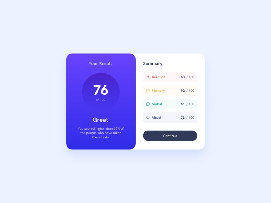
Design comparison
SolutionDesign
Solution retrospective
What are you most proud of, and what would you do differently next time?
I'm proud of the responsiveness, it looks good on mobile devices.
I definitely need to pay more attention to font sizes and use the recommendation in the style guide.
What challenges did you encounter, and how did you overcome them?When the site went live, it looks very differently to when I was coding it in VS Code. The font sizes should be bigger.
Community feedback
Please log in to post a comment
Log in with GitHubJoin our Discord community
Join thousands of Frontend Mentor community members taking the challenges, sharing resources, helping each other, and chatting about all things front-end!
Join our Discord
