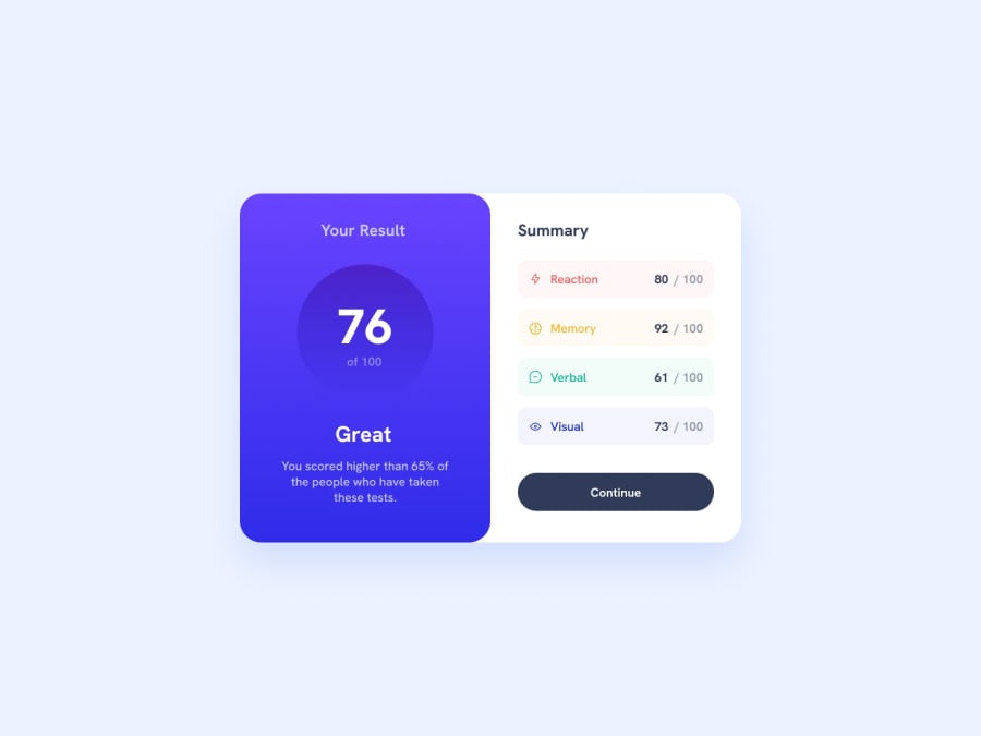
Design comparison
Community feedback
- @cisneConCorbataPosted about 2 years ago
You can also fix that border by rounding the corners of your container.
I would also recommend you to stop adding inline CSS because it will get messy once you get to work on bigger projects. Use a .css file or the <styles> tag instead.
As a last note, please use always use alt text for images and landmarks, it's important for accessibility!
Marked as helpful0@mel-starkPosted about 2 years ago@cisneConCorbata thank you for replying and for the feedback, I've generated a new report, hopefully it's more accessible now! I also kept all styles in my CSS file. I tried making all borders round but I think because there must some other style affecting the hierarchy. I'll try that again, thank you.
0@cisneConCorbataPosted about 2 years ago@mel-stark try adding the round border to .card, it seems like that's what is missing
1 - @adriano-wbPosted about 2 years ago
O HTML parece estar correto em termos de sintaxe e marcação. No entanto, aqui estão algumas sugestões de melhoria:
1. Incluir descrições significativas em elementos HTML como imagens e ícones.
2. Adicionar atributo
altem elementos de imagem para fins de acessibilidade.3. Adicionar comentários em partes importantes do código HTML para facilitar a manutenção e compreensão do código.
4. Evitar a mistura de estilos inline e externos e centralizar a estilização em um único arquivo CSS.
Marked as helpful0@mel-starkPosted about 2 years ago@adriano-wb thank you for your feedback, I've made the changes you mentioned!
0
Please log in to post a comment
Log in with GitHubJoin our Discord community
Join thousands of Frontend Mentor community members taking the challenges, sharing resources, helping each other, and chatting about all things front-end!
Join our Discord
