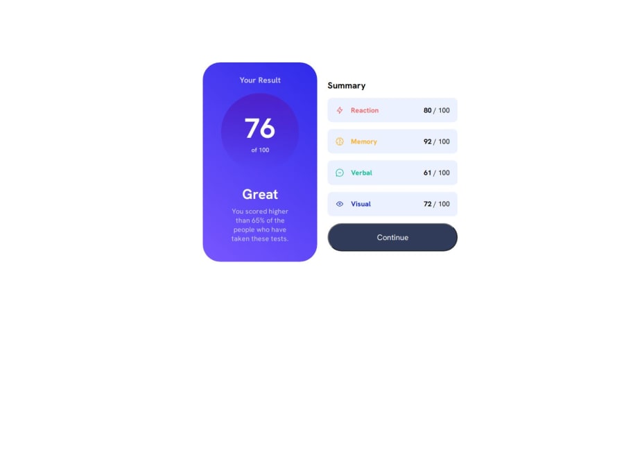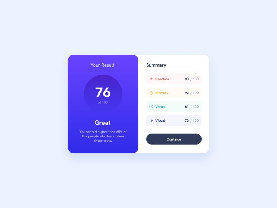
Design comparison
SolutionDesign
Solution retrospective
What are you most proud of, and what would you do differently next time?
I'm happy how I was able to make the responsive layout
What challenges did you encounter, and how did you overcome them?I'm really struggled with the background gradient (both the circle and the background) so if you have any tips about this, I would happily accept it.
What specific areas of your project would you like help with?As I said earlier, if you have tips on how to make the background gradient easily, I'm open to advices and tips.
Community feedback
- @SvitlanaSuslenkovaPosted 6 months ago
please, consider to move @media break point to 600-700px
Marked as helpful0
Please log in to post a comment
Log in with GitHubJoin our Discord community
Join thousands of Frontend Mentor community members taking the challenges, sharing resources, helping each other, and chatting about all things front-end!
Join our Discord
