Design comparison
Solution retrospective
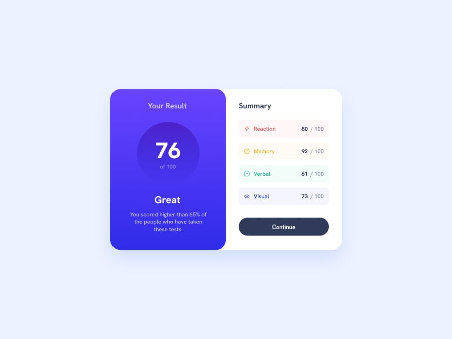
Maintaining a consistent design language, as well as implementing responsive design principles and using custom typography for sophistication by effectively using font sizes, colours and spacing. I've also paid attention to detail with the button hover and active states. Moreover, I have used semantic HTML, so that it is easier to understand the purpose of the elements, and have organised the structure in a logical and coherent manner that makes it readable to users.
What challenges did you encounter, and how did you overcome them?One main challenge was the alignment and sizing of icons, which was overcome by setting a consistent width and height for the icons with the height and width properties, as well as using the flexbox properties for proper alignment. Another was the sizing of the elements, which was overcome by specifying the class that I wanted to structure.
Community feedback
Please log in to post a comment
Log in with GitHubJoin our Discord community
Join thousands of Frontend Mentor community members taking the challenges, sharing resources, helping each other, and chatting about all things front-end!
Join our Discord
