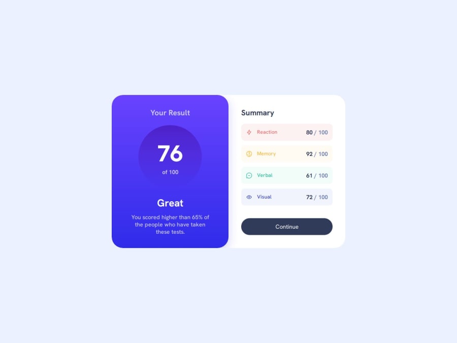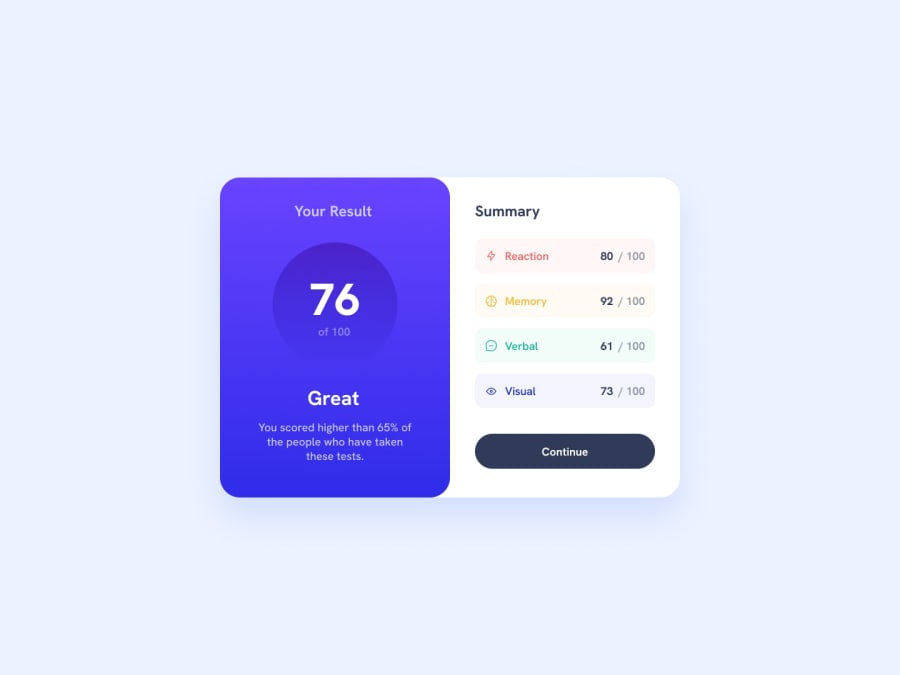
Design comparison
SolutionDesign
Solution retrospective
What are you most proud of, and what would you do differently next time?
Learning how to use Figma in a lot more depth than the previous times which led to getting the end result as close as possible to the design.
What challenges did you encounter, and how did you overcome them?Challenge was standard for the most part, except for playing with the opacity for the linear gradients, and the background colors of the categories, there weren't really any difficult parts.
What specific areas of your project would you like help with?Responsiveness, and checking whether I got the linear gradients right would be great.
Community feedback
Please log in to post a comment
Log in with GitHubJoin our Discord community
Join thousands of Frontend Mentor community members taking the challenges, sharing resources, helping each other, and chatting about all things front-end!
Join our Discord
