

Design comparison

Solution retrospective
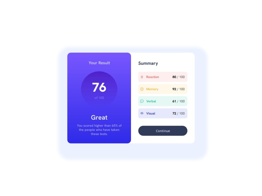
I am proud that after a lot of frustration with the summary side, I am glad I didn't give up and can present a decent looking result + a decent looking result on mobile screen.
What challenges did you encounter, and how did you overcome them?After trying to use semantic html tags for the summary side of the container (table and list) I had to give up and use separate divs instead because I just couldn't align the icons with the text.
What specific areas of your project would you like help with?I don't know any Javascript as of now, so integrating the json data was too difficult for me. If someone could explain to me how it works I am happy to try it out. After doing a couple of challenges here on Frontend Mentor I want to move on to learning Javascript soon as well.
Community feedback
- @dylan-dot-cPosted 4 months ago
Hello there! This is a great challenge and I think you did well in the design aspect, but you could improve in other areas.
- Semantic HTML: You could be more semantic with your html code by using main(for the main content) and section(for the 2 sections) you could also make the card an article if you want
<body>
   <main>// fix the landmark error(cant see it, but it sometime is there)
       <article>container
           <section></section> //container result
           <section></section> // container summary
       </article>
    </main>
</body>
-CSS: You have 100vh on the height of the body, while that aint too bad its a bit restrictive as for some screen sizes arent that long and it will cause the content to be cropped in some way, also it will look weird on a rotated mobile screen.
Good Job and take care
Marked as helpful0

Please log in to post a comment
Log in with GitHubJoin our Discord community
Join thousands of Frontend Mentor community members taking the challenges, sharing resources, helping each other, and chatting about all things front-end!
Join our Discord