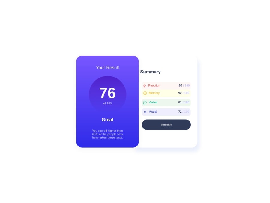
Design comparison
Solution retrospective
This challenge was so hard for me, I didn't know how to structure it properly, my scss became a big mess, well It's my second time using it, but my html is terrible... guys what can I do to improve this code or future codes? since I won't touch it not so soon.
Community feedback
- @MelvinAguilarPosted about 1 year ago
Hello there 👋. Good job on completing the challenge !
I have some suggestions about your code that might interest you.
HTML 🏷️:
- Use more descriptive class names to improve readability of front-end code. You can learn BEM naming convention to improve your class names.
CSS 🎨:
-
Using too many selectors or too many level nesting in SASS can make your code more difficult to read and maintain. Additionally, using too many selectors can lead to specificity issues, making it difficult to override existing styles.
Even when using Sass, it's advisable to avoid nesting more than three levels deep to keep your SASS files clean and maintainable. Additionally, take advantage of SASS's modularity as it's a significant advantage over plain CSS for better code organization.
- Use
min-height: 100vhinstead ofheight. Setting the height to 100vh may result in the component being cut off on smaller screens, such as a mobile phone in landscape orientation.
- The
width: 100vwproperty in the<main>tag is not necessary. This will create a horizontal scrollbar on some devices
I hope you find it useful! 😄 Above all, the solution you submitted is great!
Happy coding!
Marked as helpful4
Please log in to post a comment
Log in with GitHubJoin our Discord community
Join thousands of Frontend Mentor community members taking the challenges, sharing resources, helping each other, and chatting about all things front-end!
Join our Discord
