Results summary component with HTML, CSS and Javascript


Design comparison

Solution retrospective
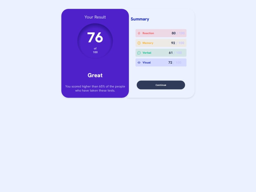
I would appreciate some help with the circle in the score section. I think it doesn't look like the original design.
Community feedback
- @QuayeDNAPosted 3 months ago
Hey! Thanks for sharing your solution. I took a look at your score circle CSS and have a few suggestions to make it match the design more closely:
- The main difference I notice is the gradient - the design uses a linear gradient instead of radial. Here's how you can fix that:
#score {
    font-weight: 800;
    padding: 2rem;
    border-radius: 50%;
    background: linear-gradient(180deg, #7857FF 0%, #6943FF 100%);
    width: 140px;
    height: 140px;
    display: flex;
    flex-direction: column;
    align-items: center;
    justify-content: center;
    margin: 0 auto;
}
Key changes:
- Removed the border as it's not in the design
- Switched to a linear gradient going from top to bottom
- Adjusted the size to 140px × 140px which looks closer to the design
- Changed padding to 2rem which gives better spacing
- Removed the box-shadow comments since they're not needed
- Used more accurate purple colors from the design
The score number inside should be around 3.5rem in size, and the "of 100" text should be smaller and slightly transparent.
Let me know if you have any questions! 😊
Marked as helpful0@JoseAlfonzo92Posted 2 months ago@QuayeDNA Thanks so much for taking the time to review my solution and for providing these detailed suggestions. I'll definitely make those changes. I use the PerfectPixel extension to try to get the design as close as possible to the original. Do you use a similar tool to get those results?
0

Please log in to post a comment
Log in with GitHubJoin our Discord community
Join thousands of Frontend Mentor community members taking the challenges, sharing resources, helping each other, and chatting about all things front-end!
Join our Discord