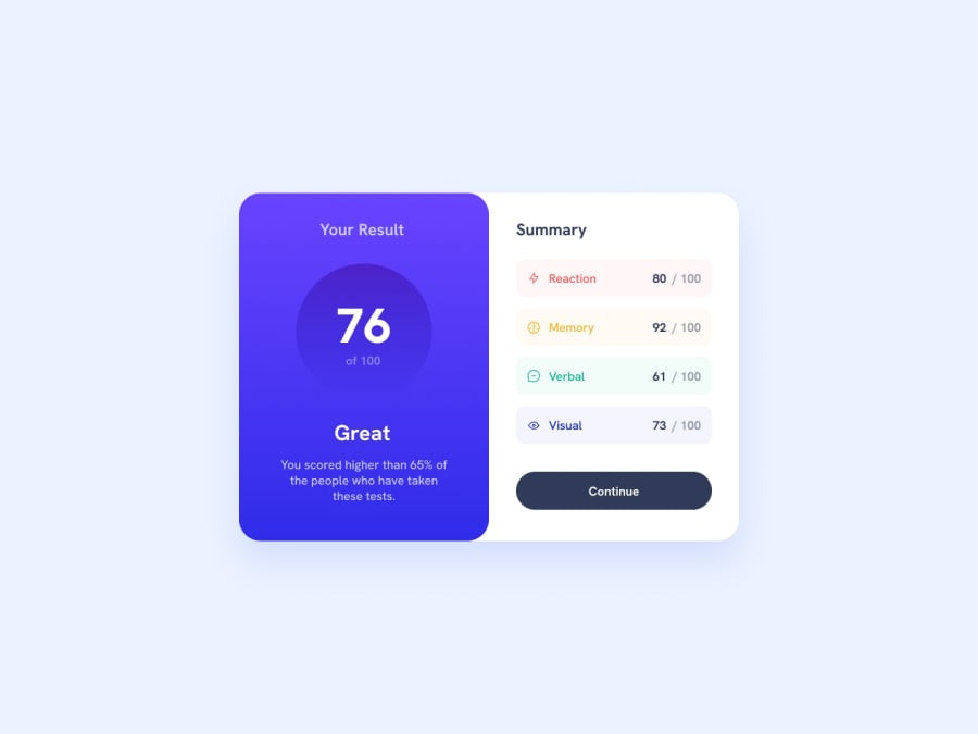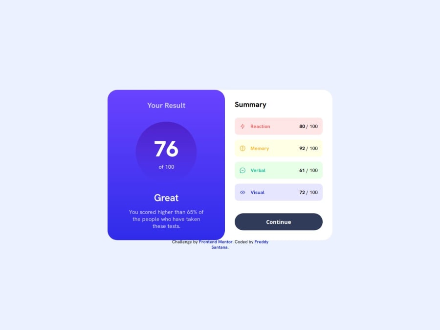
Results summary component with flex-and semantic HTML
Design comparison
Solution retrospective
Hello friends!
I just finished a new project, I think I've done pretty well and I would like to please let me know if you have any suggestions.
At the moment I'm just practicing HTML and CSS.
Thank you very much.
Community feedback
- @grace-snowPosted 9 months ago
Hi there
This is overflowing my screen because you've used explicit widths throughout. Take these principles I share and I recommend you pause and refactor all earlier projects applying the same before moving on
- You don't need a section to wrap articles, they are distinct. Personally I wouldnt use articles for this as there is nothing to be gained from it and this content would never be syndicated across different sites/pages. If you only are separationg content for layout purposes, divs are fine.
- The scores like 76/100 are one paragraph not two.
- Decorative images like these icons should have empty alt.
- The
b
tag is deprecated. Did you mean to use strong? - The attribution should be in a footer landmark outside of main.
- It's better for performance to link fonts in the html head instead of css imports.
- Don't use any heights or widths except for the icons and the circle around the overall score.
- Always use a modern css reset at the start of the styles in every project. Get into the habit now. Andy Bell has a good one you can look up and use.
- Instead of component widths use a single max width in rem on the component.
- Font size must never be in px
- The button should be full width (100%) and have no height either. Use padding.
- Media queries must be defined in rem or em not px so that it works for those who have a different text size too.
- I expect your media query is set at too small a value too. There will not be room for the large screen layout at 425px wide.
- Don't use absolute positioning for the footer attribution. Let it sit in the dom normally. Never choose arbitrary values to position elements.
0 - @Ezekiel225Posted 9 months ago
Hello there ๐
Good job on completing the challenge !
Your project looks really good!
I have a suggestion about your code that might interest you.
There is an very useful browser extension called Perfect Pixel that allow you compare with the design image and thus see the exact dimensions. I recommend it to you.
Consider changing the background-color of the body element and the div with theclass of card to hsl(0, 0%, 100%), then add a box-shadow to the section with the class of card_component.
body { background-color: hsl(0, 0%, 100%); } .card_component { background-color: hsl(0, 0%, 100%); box-shadow: 2px 2px 20px 0 rgba(0, 0, 0, 0.1); }
I hope this suggestion is useful for future projects.
Keep up the excellent work and continue to challenge yourself with new projects. Your progress is impressive, and each project is a step forward in your front-end development journey! ๐๐.
Other than that, great job!
Happy coding.
0@grace-snowPosted 9 months ago@Ezekiel225 I think you should read this post about "pixel perfection" and please stop recommending this extension to everyone: https://www.joshwcomeau.com/css/pixel-perfection/
Using extensions like that is a waste of time and developers would not do that I a real work flow. And this person you're giving feedback to has pro membership so they already have full access to the design files and all sizes/measurements.
0
Please log in to post a comment
Log in with GitHubJoin our Discord community
Join thousands of Frontend Mentor community members taking the challenges, sharing resources, helping each other, and chatting about all things front-end!
Join our Discord