Submitted over 1 year ago
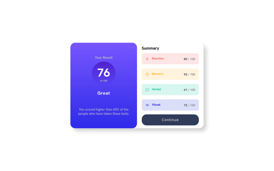
Results summary component with BEM SCSS responsive for desktop and mob
@MichalBobka
Design comparison
SolutionDesign
Solution retrospective
Hi I think it looks good. Its responsive only for two resolutions as in project description. I'm unsure about :hover on button. I had problem doing smooth transition with gradient so i did it with solid color. I will be happy if u could help me handle this :)
Community feedback
- @frank-itachiPosted over 1 year ago
Hello there 👋. Congratulation for completing the challenge👍!
- You could use the
background: linear-gradient(#color1, #color2);property-value to style the pseudo class :hover of the button. - Also try not nest too much rules in SASS/SCSS becuase the more you nest the more time will take to the browser to load the code. This way you keep the code clean as well.
I hope you find it useful! 😄 Above all, you did a good job!
Happy
<coding />😎!Marked as helpful0 - You could use the
Please log in to post a comment
Log in with GitHubJoin our Discord community
Join thousands of Frontend Mentor community members taking the challenges, sharing resources, helping each other, and chatting about all things front-end!
Join our Discord
