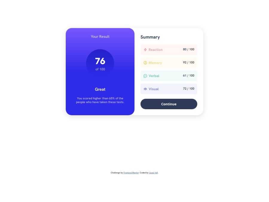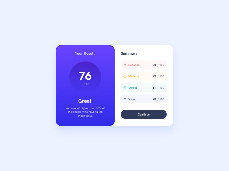
Design comparison
Solution retrospective
I'm proud of how clean and responsive the design turned out to be while maintaining simplicity and clarity. Implementing a solution that effectively communicates information while also being visually appealing is always a satisfying accomplishment.
In terms of what I would do differently next time, I might explore incorporating more advanced CSS techniques or animations to enhance the user experience further. Additionally, I could focus more on optimizing the code for performance, especially if dealing with larger-scale projects. Continuous learning and improvement are essential, so each project provides an opportunity to refine skills and approaches for future endeavors.
What challenges did you encounter, and how did you overcome them?During the implementation of this project, I encountered a few challenges:
- Responsive Design.
- CSS Styling.
- Cross-browser Compatibility.
- Semantic HTML Structure.
In this project, I would appreciate help or feedback in the following areas:
- Code Optimization
- Accessibility
- Browser Compatibility
- UI/UX Design
- Performance Optimization
- Responsive Design
Community feedback
Please log in to post a comment
Log in with GitHubJoin our Discord community
Join thousands of Frontend Mentor community members taking the challenges, sharing resources, helping each other, and chatting about all things front-end!
Join our Discord
