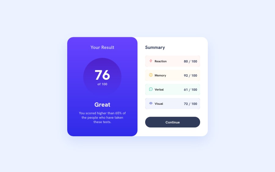
Results summary component w/ (NextJs + StyledComponents) 👨💻
Design comparison
Solution retrospective
👨💻 Hello everyone.
This was my first project with NextJs, I'm very happy with the result and excited to learn more about this framework, however as it is the first project I decided to do something a little simpler, so as not to get too stuck in the development of the project, but in soon I will do some more elaborate project.
As you can see in the "DESIGN COMPARISON" section, my project has a white bar, this has happened other times, but as you can see it's just in the picture, if you look at the project's deployment it's normal!
If you know why this is happening, feel free to let me know.
Thanks! 😊
Community feedback
- @sanba-anassPosted over 1 year ago
how you scale the component to be big like that mine looks smale i don't know if i"m doing something wrong thanks in advance and congrats!
0
Please log in to post a comment
Log in with GitHubJoin our Discord community
Join thousands of Frontend Mentor community members taking the challenges, sharing resources, helping each other, and chatting about all things front-end!
Join our Discord
