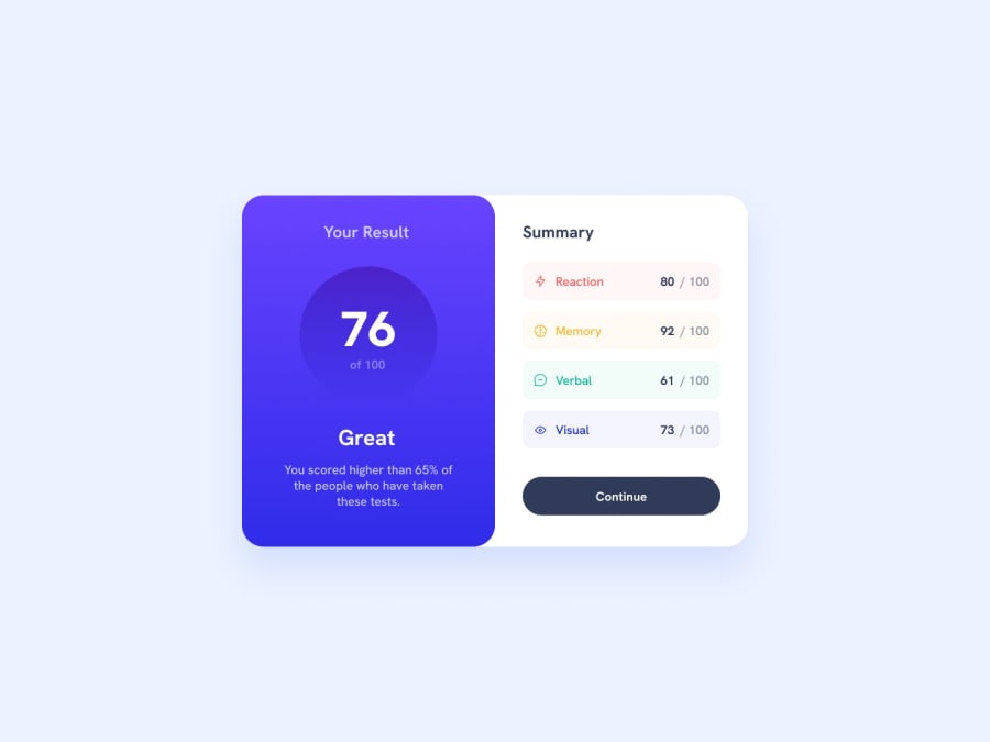
Design comparison
Solution retrospective
I fixed the flex problem, thanks to all who have helped!
Community feedback
- P@danyela2000Posted almost 2 years ago
Hi, congratulations on completing this project!
-
In the CSS file, on the ".section" selector, you used the "justify-content: space-between;" property. This adds an equal space between flex elements and this should be removed, because you don't want the elements to be equally spaced, in this case.
-
You can group the last two elements (the current score and the percent) in one paragraph with a class of "detailed score", and set a "margin-left : auto;" to this paragraph. This property will align them to the right. Instead of using two separated paragraphs for each element, you can wrap the percent into a <span> element and style it separately, like so:
<p class="detailed score">80 <span class="hundred"> / 100</span></p>You can find out more about how to use auto property on margins to align elements in a flexbox, here :
- https://css-tricks.com/the-peculiar-magic-of-flexbox-and-auto-margins/
- https://css-tricks.com/how-auto-margins-work-in-flexbox/
-
Then, you should set a margin left of 1em on the h3 element, to add a bit more space between it and the icon.
-
Regarding the button, you can fix it like so: Remove the div that wraps the button element.
And now, the button is a "child" of the ".summary" container. You should:
- set the ".summary" selector to be a flex container. (display: flex)
- set the direction of the flex to be on the column not on rows ( "flex-direction: column")
- and last but not least: don't forget to center the text inside the button element!
That's it. I hope it helped you to solve the problem! Good luck on your learning journey!
Marked as helpful0@ughvopPosted almost 2 years agoomg I totally forgot about span! thank you so much, I appreciate your help @danyela2000
0 -
- @mukwende2000Posted almost 2 years ago
Change the div with the class button into a real button element, it should not be a div, and give it a width of 100%
Marked as helpful0 - @mukwende2000Posted almost 2 years ago
To make it two to the left and two to the right, do it this way, wrap the the two element in div tags and the give the parent div a flex
<div class="reaction section">
<div class="left">
<img >
<h3>Reaction</h3>
</div>
<div class="right">
<p>80</p>
<p>100</p>
<div>
</div>
</div>

.left, .right { display: flex}
Marked as helpful0@ughvopPosted almost 2 years agothanks a lot! that was super helpful. and the button too @mukwende2000
0 - @sanajaniPosted almost 2 years ago
look dear you should see div as box. things and elements that should be together put them inside single div like you have image and text put them inside one div and text that left put that inside another div then on parent element add flex with justify-content that will work
0
Please log in to post a comment
Log in with GitHubJoin our Discord community
Join thousands of Frontend Mentor community members taking the challenges, sharing resources, helping each other, and chatting about all things front-end!
Join our Discord
