Design comparison
SolutionDesign
Solution retrospective
Hey, com! Please review this project and advice on the best practices.
Thanks, Pretty
Community feedback
- @0xabdulkhaliqPosted over 1 year ago
Hello there 👋. Congratulations on successfully completing the challenge! 🎉
- I have other recommendations regarding your code that I believe will be of great interest to you.
HEADINGS ⚠️:
- This solution had generated accessibility error report due to lack of level-one heading
<h1>
- Every site must want at least one
h1element identifying and describing the main content of the page.
- An
h1heading provides an important navigation point for users of assistive technologies, allowing them to easily find the main content of the page.
- So we want to add a level-one heading to improve accessibility by reading aloud the heading by screen readers, you can achieve this by adding a
sr-onlyclass to hide it from visual users (it will be useful for visually impaired users)
.
I hope you find this helpful 😄 Above all, the solution you submitted is great !
Happy coding!
Marked as helpful0 - @yashraj1309Posted over 1 year ago
Hi, here are few suggestions
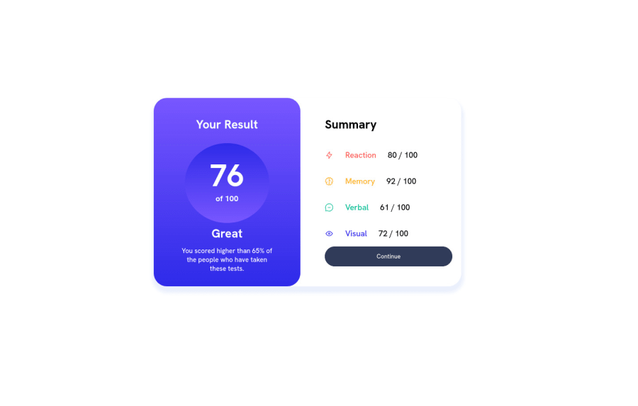
- First of all in "left-section" all the subcomponents of "summery" needs background color. You can do this using "Background-color".
- In Subsections (Memory and all) You need to wrap <img> and <p> tag. Then use Flex and Justify-content: Space-between to arrange items as per requirement.
- Also in Subsection <p> tag content should be bold.
That's it from my side, Happy Coding :)
0
Please log in to post a comment
Log in with GitHubJoin our Discord community
Join thousands of Frontend Mentor community members taking the challenges, sharing resources, helping each other, and chatting about all things front-end!
Join our Discord
