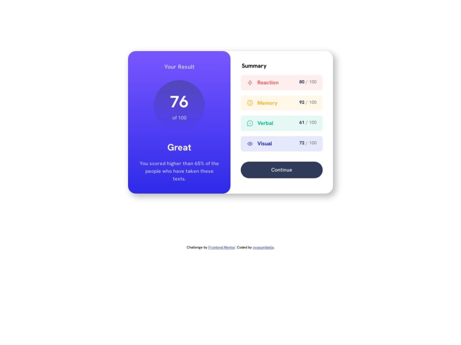
Design comparison
Solution retrospective
Hello! I just finished completing this challenge. Any suggestions or feedback is very much appreciated, it would be of huge help for me.
I also like to ask whether I should focus learning more on flexbox or grid in CSS.
Community feedback
- @Kamlesh0007Posted over 1 year ago
Congratulations on completing the challenge! That's a great achievement, and I'm sure you put a lot of effort into it. I really liked the way you approached the challenge and the code you wrote. You demonstrated a good understanding of the concepts and applied them effectively to solve the problem.I have a few suggestions to improve your code further. you need to add hover effect to button to make the button as per design and also you can add the cursor:pointer to a button element to change the cursor to a pointer when hovering over the button. This is important to provide visual feedback to users and indicate that the button is clickable or interactive.
button:hover{
background: linear-gradient( 252, 100%, 67%,  241, 81%, 54%);
cursor:pointer;
}
Marked as helpful1
Please log in to post a comment
Log in with GitHubJoin our Discord community
Join thousands of Frontend Mentor community members taking the challenges, sharing resources, helping each other, and chatting about all things front-end!
Join our Discord
