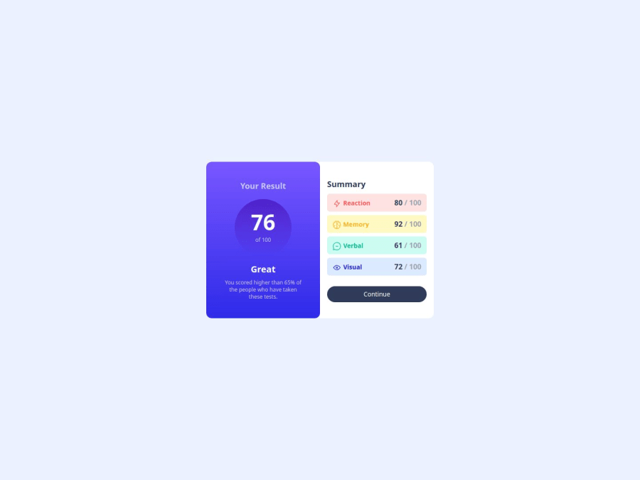
Results Summary Component Using Tailwind CSS
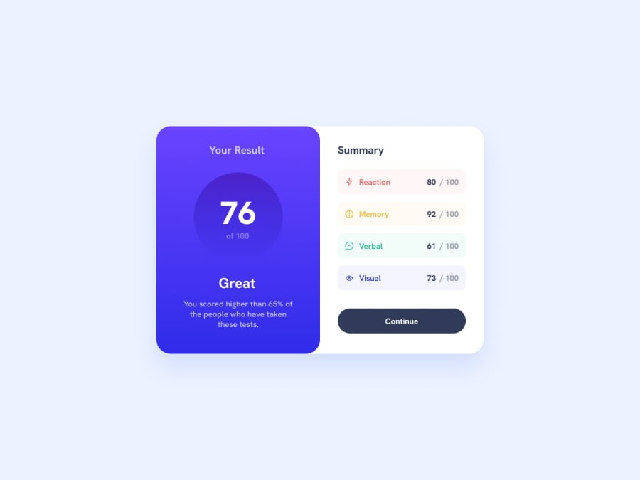
Design comparison
Solution retrospective
I learned a lot during the process without looking at someone code or something like that.
Currently I can refactor my code and make it less verbose
What challenges did you encounter, and how did you overcome them?Border bottom radius setting in small screen took me some time but learned somethings along the way so no problem at it.
I referred the tailwind docs and played with different properties.
What specific areas of your project would you like help with?In small screen display the summary width is full but the font sizes are small. I typed them by hard code but I don't want to do that instead in a tutorial the instructor didn't use any media queries but everything aligned perfectly in his project. So I was thinking about how can I make the code more responsive without writing too much code.
Community feedback
Please log in to post a comment
Log in with GitHubJoin our Discord community
Join thousands of Frontend Mentor community members taking the challenges, sharing resources, helping each other, and chatting about all things front-end!
Join our Discord
