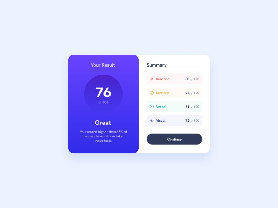
Design comparison
Solution retrospective
Hey, community! This is the 3rd project done with SCSS. It could be done much easier with pure css, because I feel like there would be less lines of code, it would be more maintainable and not that messed up :) But I learned about property lists, some SCSS funstions and @each loop. I'll be glad to know how to improve my code, if you have something to say about it)
Community feedback
- @Mirjax2000Posted over 1 year ago
I like your solution for that button animation, normaly we cant use transition for background gradient. So this opacity trick is briliant.
are you using Sass extension for vs code? dont!! https://www.youtube.com/watch?v=o4cECvhrBo8&ab_channel=KevinPowell which leads to dont use @import, instead you have to use @use or @forward. https://www.youtube.com/watch?v=CR-a8upNjJ0&ab_channel=KevinPowell
i like your scss styling, but i dont see there any placeholders or mixins.
it is good that you are using mediaqueries directly with class, but i like my MQ bottom on one place and i know exactly where to look for . Your MQ for bttn isnt working, you disabled for lower resolution, is it intendent? it doesnt need to be there, just write
.button{ &:hover::after { opacity:1 } without MQ.
And that thing with MQ in .classes, few days ago, there is new function call it @media container, you format your element not all page. so i cant imagine how it will be readible with MQ and MQ containers. But we have to tryed first. for me its very good performance what you did with this challenge. you can check my solution, but i dont have bttn animation, i solved it after i reviewed your solution.
https://www.frontendmentor.io/solutions/it-is-responzive-and-it-calculates-rng-data-to-percentage-FxQbpaRaMv
keep up good work.
Marked as helpful0 - @NikitossikPosted over 1 year ago
Hey, thanks a lot for your comment! I've just watched the videos you sent, it's pretty cool using npm for compiling SCSS, in my project I used Gulp instead, just to try) but the thing in the video seems to be easier, I'll definitely give it a shot)
Yeah, I added ::hover only for desktops on purpose, because on smaller screens
::hover
behavior is different because of touchscreens and stuff. Maybe I could add::focus
or::active
for these cases.I heard about
@container
queries, that's really cool thing to try. I do think that my code is pretty messy because of@media
. I had to change paddings and margins inside them. Firstly I thought about writing a@mixin
forclamp
function, so not only typography would be adaptive to the viewport, but spacing too. I'm new to SCSS, I haven't tried@mixins
yet0@Mirjax2000Posted over 1 year ago@Nikitossik that clamp functions you have there, how did you calculate this values? You are using them for font sizes and that is interesting.I have to check them again and test it for myself.
I am usin gulp as well, modules for autoprefixing, module for Sass, module for minification and module for webp pictures. and best from scss is that you can write "default" mixin with variables values and specifcate them in scss code.
0@NikitossikPosted over 1 year ago@Mirjax2000 I used this clamp generator. It's really flexible, you can set the min and max values for font sizes and screen sizes and it will give you the "ideal" value that will scale linearly between the two limits
0
Please log in to post a comment
Log in with GitHubJoin our Discord community
Join thousands of Frontend Mentor community members taking the challenges, sharing resources, helping each other, and chatting about all things front-end!
Join our Discord