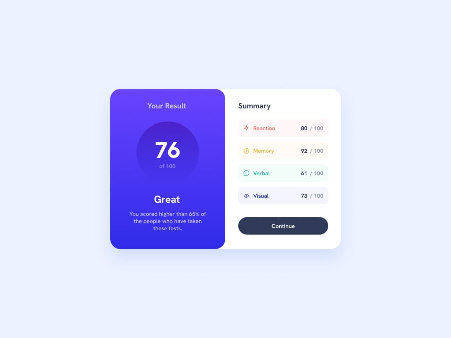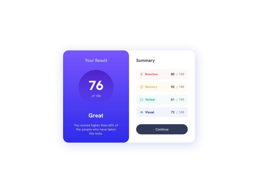
Design comparison
Solution retrospective
Hello everyone! π
Finally, I have completed my first challenge submission on this platform.
Certainly, there were parts that made me a bit uncomfortable when I first started working on it. I had to use Figma to sketch roughly and estimate the sizes of UI elements. Fortunately, the result turned out to be quite close to the provided reference image. Maybe someday I will upgrade to PRO to obtain the Figma file.
The most challenging part was replicating the gradient effect. I haven't found the exact color settings yet.
I'm also unsure about the usage of Semantic HTML5 in this project. In the "score" section, should I use an unordered list (ul) or is it sufficient to use just 'div'?
If you have any suggestions regarding the above points, I would be very happy to hear them!
Community feedback
- @Refer59Posted over 1 year ago
You usually use UL when you gonna put inside a list of uknown number of elements that are similar, each one shares the same structure but different information.
<ul> <li> <span class='left-side'><img src="user-456.png" alt="user-image" /></span> <span class='right-side'>Username-1234</span> </li> <li> <span class='left-side'><img src="user-456.png" alt="user-image" /></span> <span class='right-side'>Username-456</span> </li> <li> <span class='left-side'><img src="user-789.png" alt="user-image" /></span> <span class='right-side'>Username-789</span> </li> </ul>
As you see, the all follows the same content format, but the information content is diferent. You can actually use Div or UL, but as good practice you follow the this criteria.
Marked as helpful1@siswantodevPosted over 1 year agoThank you for your detailed explanation.
I realize that there seem to be two different opinions regarding the use of UL or DIV in this case. From my perspective, it appears that using UL is more acceptable for this challenge. Thanks again @Refer59!
0 - @AutumnsCodePosted over 1 year ago
If you want to use ul/ol and li, you certainly could. However, you would have to add some extra steps to your css/sass like:
margin: 0 padding: 0 list-style: none
Like you, I am using not the pro Version, so it is much more difficult to really get it on point. nonetheless I am using like gradient generator to get gradient as close as the picture. Just google it. i hope my comment was useful for you.
Marked as helpful1@siswantodevPosted over 1 year agoGlad to receive valuable feedback from you @AutumnsCode! Gradient generator seems interesting, I will give it a try.
0
Please log in to post a comment
Log in with GitHubJoin our Discord community
Join thousands of Frontend Mentor community members taking the challenges, sharing resources, helping each other, and chatting about all things front-end!
Join our Discord