Submitted about 1 year ago
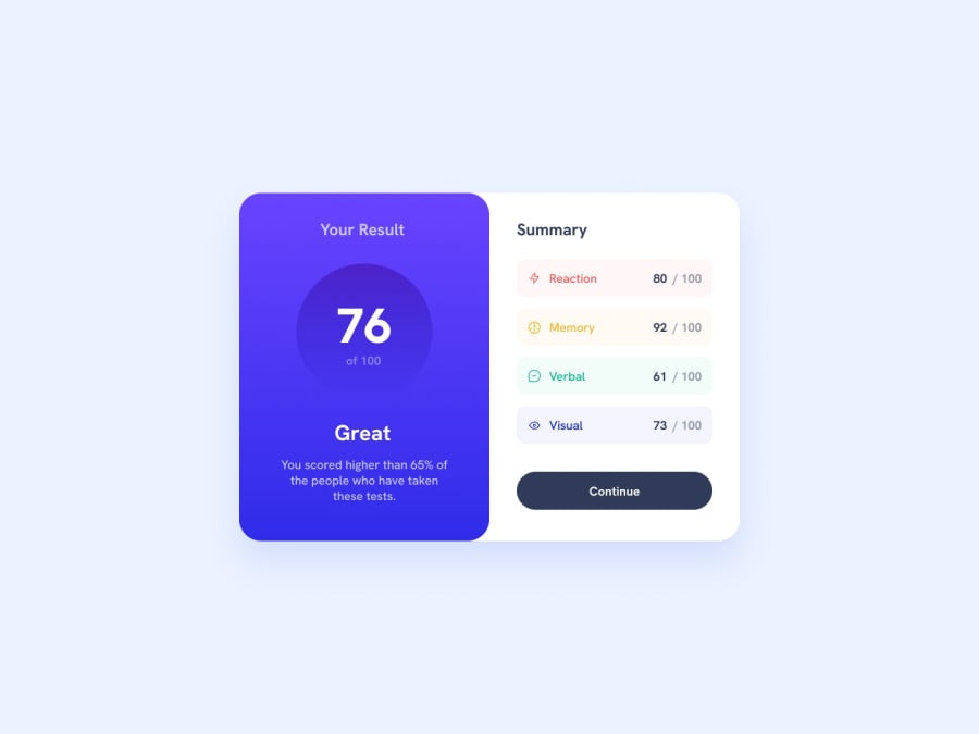
Results summary component using inline-block and flex
@shalewa-1
Design comparison
SolutionDesign
Solution retrospective
just a newbie on a first project. :)
Community feedback
- @vishalyv252Posted about 1 year ago
I have made corrections to your code and correct it.
For centring the item: Here's the code :
.main-page { display: flex; justify-content: center; align-items: center; height:100%; width:100%; }
At image element: -> First Thing, make sure to check the file location path of the icon image. -> Second Thing, Type some description at the alt attribute of the image icon.
1 - @LawrenceEkenePosted about 1 year ago
Nicely done.
I just want to know how you were able to create that halo effect after the general score.
0
Please log in to post a comment
Log in with GitHubJoin our Discord community
Join thousands of Frontend Mentor community members taking the challenges, sharing resources, helping each other, and chatting about all things front-end!
Join our Discord