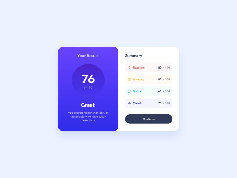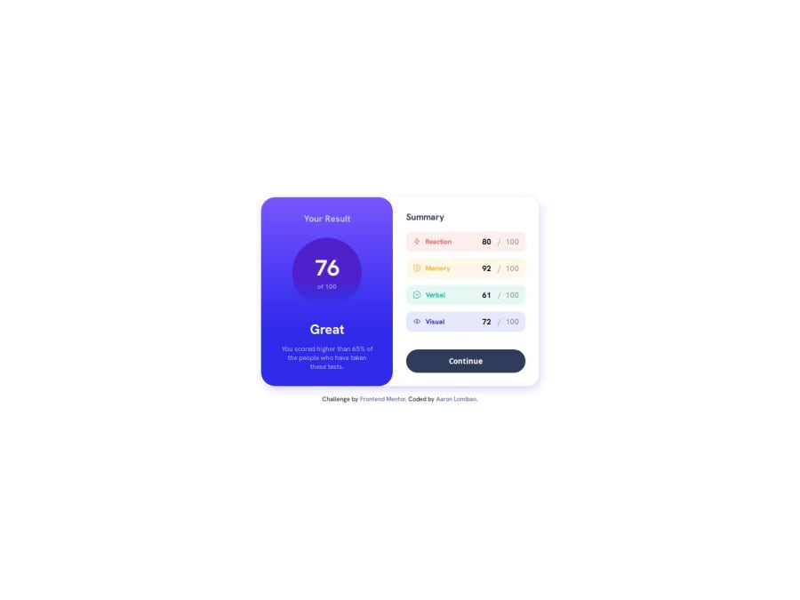
Design comparison
Solution retrospective
I manage to get the right gradient and color without the figma file. I would probably try different CSS methodology or use a CSS framework.
What challenges did you encounter, and how did you overcome them?The challenges I encounter is to get the right gradient, also the responsiveness and spacing. I manage to get the right gradient by using gradient generator (https://gradient.style/) and I use flexbox so I can add spacing with gap instead of margin and it also helps me to improve the responsiveness of the website.
What specific areas of your project would you like help with?if you have time please check my code and the website if there's some issue or need some improvement. Thank you in advance.
Community feedback
- @danielmrz-devPosted 6 months ago
Hello @AaronL9!
Your solution looks excelent!
I have just one suggestion:
📌 To improve semantic clarity, try to maintain the titles hierarchy with
<h1>
,<h2>
<h3>
, and so on.It's more than just text size — it's about structuring your content effectively:
<h1>
to<h6>
are used to define HTML headings, with<h1>
being the most significant.
While these adjustments might not alter the visual appearance much, they significantly enhance semantic clarity, SEO optimization, and accessibility.
Hope this suggestion proves helpful! Keep up the great work!
Marked as helpful1 - @R3ygoskiPosted 6 months ago
Hello Aaron,
Congratulations on completing your challenge! It looks really good.
I did what you said; I took a look at the website and the code. Regarding the website, it's looking great. The responsiveness is working well, both on smaller and larger screens. Well done!
Regarding the code, let's talk about HTML. Your structure is correct, but your HTML is lacking in semantics, and this semantic part is very important, not only for SEO but also to ensure that your site is more accessible. Here are some tags that could be replaced with more semantic ones:
<div class="card">
: Instead of usingdiv
, you could use<main>
because it's the main content of your page. But if you don't want to use<main>
, you could also use<article>
because this content is self-explanatory.<div class="card__result">
and<div class="card__summary">
: These could also be<article>
because both are self-explanatory.<div class="card__summary-result">
: This could be a<section>
because its content is related to the same topic and because it's not self-explanatory.
Once again, congratulations! Keep practicing and improving; your project is very well done. If you have any questions, please ask below, and I'll try to help in the best way possible.
Marked as helpful1 - @0xabdulkhaliqPosted 6 months ago
Hello there 👋. Congratulations on successfully completing the challenge! 🎉
- I have a suggestion regarding your code that I believe will be of great interest to you.
CSS 🎨:
- Looks like the component
button
hover state background has not been set yet.
- Just add the following css rules
.card__summary-btn:hover { background-image: linear-gradient(#6542FE, #342CE2); }
- Now your component's
button
background for hover state has been set properly
.
I hope you find this helpful 😄 Above all, the solution you submitted is great !
Happy coding!
1@AaronL9Posted 6 months ago@0xabdulkhalid Thank you for your reply. I actually did that while I'm building the website, but I want to add a transition when the button is hovered; unfortunately, it doesn't work. Upon searching on the internet, I found out that background gradients don't support transitions, so what I did instead was create a pseudo-element with the gradient background and manipulate its opacity.
.card__summary-btn::before { content: ""; width: 100%; height: 100%; background-image: linear-gradient( 180deg in hsl, hsl(252, 100%, 67%) 0%, hsl(241, 81%, 54%) 70% 88% ); position: absolute; top: 0; left: 0; z-index: -1; opacity: 0; transition: opacity 250ms ease; } .card__summary-btn:hover::before { opacity: 1; }
Feel free to comment with any feedback if there's a better way to do this. Thank you!
0@0xabdulkhaliqPosted 6 months ago@AaronL9, You're so struggling to make that transition right ?
You don't need
:before
for that, Instead you can try this!.card__summary-btn { background-image: linear-gradient(90deg,#303b5a 30%,#6542FE 55%,#342CE2 100%); background-size: 500%; background-position: left; transition: background 500ms ease; } .card__summary-btn:hover { background-position: right; }
Additionally i changed
all
tobackground
ontransition
to only target onbackground
transition instead of waiting for all sort of changes onbutton
element.Hope my suggestion with working code helpful to you!
Marked as helpful1@AaronL9Posted 6 months ago@0xabdulkhalid Thanks! It works! I learned something new today. thank you so much. I'm just wondering if I can achieve a fade-in transition effect using this?
0
Please log in to post a comment
Log in with GitHubJoin our Discord community
Join thousands of Frontend Mentor community members taking the challenges, sharing resources, helping each other, and chatting about all things front-end!
Join our Discord