Submitted 6 months ago
Results summary component using HTML, Vanilla CSS & Flexblox
@FabianAM07
Design comparison
SolutionDesign
Solution retrospective
What are you most proud of, and what would you do differently next time?
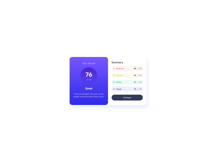
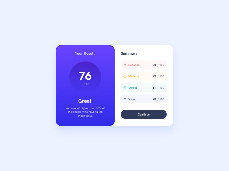
I feel proud about the design, I think i´ts pretty close from the original design on mobile and laptop screen sizes. the only thing I should improve its the amount of code for the design.
What challenges did you encounter, and how did you overcome them?In this case it was easy to built, I didn´t found any specific challenge.
What specific areas of your project would you like help with?Any tips or recommendations are welcome, thanks! 🙂
Community feedback
Please log in to post a comment
Log in with GitHubJoin our Discord community
Join thousands of Frontend Mentor community members taking the challenges, sharing resources, helping each other, and chatting about all things front-end!
Join our Discord
