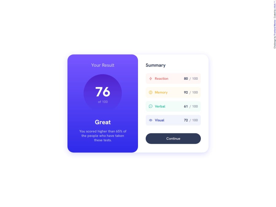
Design comparison
SolutionDesign
Community feedback
- @mkborisPosted 3 months ago
Great work, one thing I would suggest is not using fixed widths on elements as this can create problems with responsiveness and content fit. Use
max-widthand prefer relative units likeremfor better adaptability. Your .card should use amax-widthrather and it should be defined inrem. Also, media queries, font-sizes should be defined inremnot px. Keep up the good work, and good luck!Marked as helpful1@chlvkPosted 2 months ago@mkboris Thanks for your feedback. I'm in the process of learning how to use the things you mentioned and will try to use them later when doing new challenges.
1
Please log in to post a comment
Log in with GitHubJoin our Discord community
Join thousands of Frontend Mentor community members taking the challenges, sharing resources, helping each other, and chatting about all things front-end!
Join our Discord
