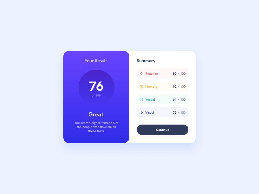
Design comparison
Solution retrospective
Mahn this was tough. Took me 2 days and many videos. It might not be perfect but i think I did pretty well here. Any feedbacks are appreciated.
Community feedback
- @itushPosted over 1 year ago
Congratulations on completing the challenge! π
Your solution looks nice to me :)
In my projects:
- I always start with mobile-first workflow.
- I use at least one main element for a page (entire content goes into the main), and avoid divs as much as possible and use section and article element wherever I can.
<body> <main> All content </main> </body>
-
I Use relative units as much as possible and avoid absolute units whenever possible.
-
I remember when I started out, I made countless mistakes and spent long hours searching for solutions. But hey, you don't need to go through the same struggles! π To help you shorten the learning curve, I recommend going through the following articles. They contain valuable insights that can make your journey smoother:
ππ 12 important CSS topics where I discuss about css position, z-index, box-model, flexbox, grid, media queries, mobile-first workflow, best practices etc. in a simple way.
ππ 11 important HTML topics where I discuss about my thought process and approach to convert a design/mock-up to HTML along with other topics.
I hope you find these resources helpful in your coding adventures! π€
I'm eagerly looking forward to seeing the amazing projects you'll create in the future! ππ»
Keep up the fantastic work and happy hacking! πͺβ¨
Marked as helpful1
Please log in to post a comment
Log in with GitHubJoin our Discord community
Join thousands of Frontend Mentor community members taking the challenges, sharing resources, helping each other, and chatting about all things front-end!
Join our Discord