Submitted over 1 year ago
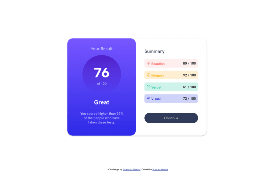
Results summary component using HTML and CSS
@ViniciusB-Garcia
Design comparison
SolutionDesign
Solution retrospective
I found it a little complicated to align all the information in its proper places, but I liked the result. Suggestions where I can improve?
Community feedback
Please log in to post a comment
Log in with GitHubJoin our Discord community
Join thousands of Frontend Mentor community members taking the challenges, sharing resources, helping each other, and chatting about all things front-end!
Join our Discord
