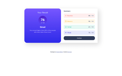
Design comparison
Solution retrospective
I'm a little unsure if the min-width in my media query is the best fit for this project. Overall, it was exciting building my first project from frontend mentor. Looking forward to more of this.
Do let me know what you think
Community feedback
- @0xabdulPosted almost 2 years ago
Hello Developer well congratulations on successfully completed the results summary component
- A Some suggestions for improve your code
- In Html π :
- LANDMARKS π
- the html page should be contained
one main landmark
- to clear the Accessibility reports use sematic elements or non semantic elements..
- Semantic elements βοΈ
- <aside> <nav> <section> <main> <header> <footer> <article> Ect..
- using semantic elements
- Ex :
<html lang="en"> <head> <title>my page</title> </head> <body> <header> //logo img or heading ect... //Using heading only </header> <main> //Use only main of the contents </main> <footer> //use copy write discription or challenge d by front end mentor code by mark.. </footer> </body> </html>
- HEADING β οΈ
- The page must contain at least one h1 element identifying and describing the main content of the page. An h1 heading provides an important navigation point for users of assistive technologies, allowing them to easily find the main content of the page.
- So fix them
- Ex :
<h1> </h1> <h2> </h2> <h3> </h3>
- Note : we use the headings line by line in order way
- In Css π¨ :
- And your results summary component is not center aligning so fix the problem
- Ex :
body { display:grid; place-items:center; margin:0; height:100vh; }
- Now center aligning π―
- I Hope you find the solution and it's useful comment for you your results summary component project doing very well Happy Coding Developer
Marked as helpful0@IpieAPosted almost 2 years ago@0xAbdul Thanks for your feedback Abdul. It's much appreciatedπ. I'd work with your suggestions to improve my code
0 - @PetrosdevriPosted almost 2 years ago
Hey there, nice work and congrats for completing the project, I am also a newbie here :P .
A few notes on your solution:
- I don't think you need to add
min-width
since the current implementation seems to fit well within mobile screens, plus defined margins are sufficient. Overall, you could answer me and elaborate on this proposal. - You could probably work a bit on reducing the width of the
.result
and.summary
sections. While the current implementation is still adequate, it occupies more space than needed. You may switch themax-width
property defined incontainer
to a lower value. - Range is a bit far-fetched compared to the ratio but I have done the same so it's overall fine.
In conclusion, your project seems to be decent and by working on various details and practicing frequently you will be able to achieve even better results.
Marked as helpful0@IpieAPosted almost 2 years ago@Petrosdevri Thanks for the notes. I'd improve my code with your notesπ
1 - I don't think you need to add
- @0xabdulkhaliqPosted almost 2 years ago
Hello there π. Congratulations on successfully completing the challenge! π
- I have other recommendations regarding your code that I believe will be of great interest to you.
HTML π·οΈ:
- This solution generates accessibility error reports, "All page content should be contained by landmarks" is due to
non-semantic
markup, which lack landmark for a webpage
- So fix it by replacing the
<div class="container">
element with the semantic element<main>
along with<div class="attribution">
into a<footer>
element in yourindex.html
file to improve accessibility and organization of your page.
- What is meant by landmark ?, They used to define major sections of your page instead of relying on generic elements like
<div>
or<span>
- They convey the structure of your page. For example, the
<main>
element should include all content directly related to the page's main idea, so there should only be one per page
HEADINGS β οΈ:
- And, this solution has also generated accessibility error report due to lack of level-one heading
<h1>
- Every site must want at least one
h1
element identifying and describing the main content of the page.
- An
h1
heading provides an important navigation point for users of assistive technologies, allowing them to easily find the main content of the page.
- So we want to add a level-one heading to improve accessibility by reading aloud the heading by screen readers, you can achieve this by adding a
sr-only
class to hide it from visual users (it will be useful for visually impaired users)
CSS π¨:
- let me explain, How you can easily center the component.
- We don't need to use
margin
andpadding
to center the component both horizontally & vertically. Because usingmargin
orpadding
will not dynamical centers our component at all states
- To properly center the component in the page, you should use
Flexbox
orGrid
layout. You can read more about centering in CSS here π.
- For this demonstration we use css
Grid
to center the component
body { min-height: 100vh; display: grid; place-items: center; margin: 0; }
- Now remove these styles, after removing you can able to see the changes
.container { margin: 30px auto; }
.
I hope you find this helpful π Above all, the solution you submitted is great !
Happy coding!
Marked as helpful0@IpieAPosted almost 2 years ago@0xAbdulKhalid Thank you for your kind feedbackπ I'd definitely improve my code with your suggestions
0
Please log in to post a comment
Log in with GitHubJoin our Discord community
Join thousands of Frontend Mentor community members taking the challenges, sharing resources, helping each other, and chatting about all things front-end!
Join our Discord