Not Found
Not Found
Not Found
Not Found
Not Found
Not Found
Not Found
Not Found
Not Found
Not Found
Not Found
Not Found
Not Found
Not Found
Not Found
Not Found
Not Found
Not Found
Not Found
Not Found

Submitted

results summary component using flexbox

Fayeβ€’ 80

@FayeVinyl

Desktop design screenshot for the Results summary component coding challenge

This is a solution for...

  • HTML
  • CSS
1newbie
View challenge

Design comparison


SolutionDesign

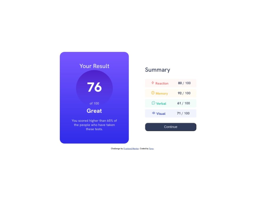
Solution retrospective


I was unable to figure out how to add the corner borders to the summary section. I'm certain my css could be cleaner. I learned a lot about flexbox

Community feedback

Abdul Khaliq πŸš€β€’ 72,660

@0xabdulkhaliq

Posted

Hello there πŸ‘‹. Congratulations on successfully completing the challenge! πŸŽ‰

  • I have other recommendations regarding your code that I believe will be of great interest to you.

POINTING CURSOR ↗️:

  • Looks like the component's button element has not a pointer, this property plays a major-role in terms of both UI & UX
  • The cursor: pointer CSS property is important for button-like elements because it changes the cursor from the default arrow to a pointer when hovering over the element. This provides a visual cue to the user that the element is clickable and encourages interaction.
  • In terms of UI/UX, using cursor: pointer helps to improve the usability of the interface by making it easier for users to identify interactive elements. It also helps to provide feedback to the user by indicating which elements are clickable and which are not.
  • So we want to add this property to the following button element
button {
cursor: pointer;
}
  • Now your component's button has got the pointer & you learned about this property as well

.

I hope you find this helpful πŸ˜„ Above all, the solution you submitted is great !

Happy coding!

Marked as helpful

1
_nehalπŸ’Žβ€’ 6,710

@NehalSahu8055

Posted

Hello Coder πŸ‘‹.

Congratulations on successfully completing the challenge! πŸŽ‰

Few suggestions regarding design.

  • Use gradient button:hover

  • background-image: linear-gradient(#6542FE,#342CE2);

  • To properly center the container.

  • USING FLEXBOX

body{
min-height: 100vh;
display: flex;
align-items: center;
justify-content: center;
}
  • USING GRID
body{
min-height: 100vh;
display: grid;
place-items: center;
}
  • For image like .svg are decorative which screen reader will not render it to be important and skip it, so it make no sense to add alt leave it blank.

  • Use cursor:pointer for buttons for more user friendly.

  • Use Semantics for the proper design of your code.

<body>
<header>
<nav>...</nav>
</header>
<main>...</main>
<footer>...</footer>
</body>

I hope you find this helpful.

Happy codingπŸ˜„

Marked as helpful

1

Please log in to post a comment

Log in with GitHub
Discord logo

Join our Discord community

Join thousands of Frontend Mentor community members taking the challenges, sharing resources, helping each other, and chatting about all things front-end!

Join our Discord