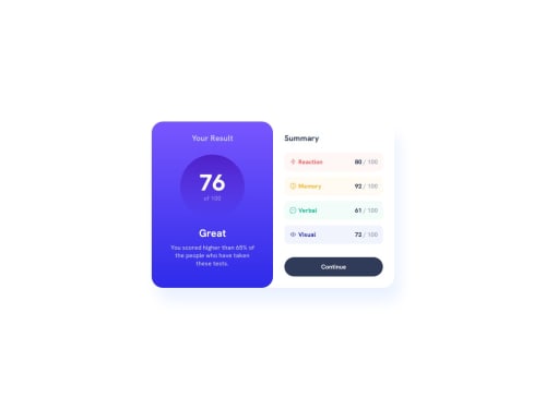
Submitted over 1 year agoA solution to the Results summary component challenge
Results summary component using flexbox and grid layout
@murilomonte

Solution retrospective
What challenges did you encounter, and how did you overcome them?
I had problems implementing responsiveness. I was having trouble making the items in the main container take up 100% of the screen when breaking the line. However, I solved it using flexbox shrink, grow and basis.
What specific areas of your project would you like help with?At around 640px, the container gets stuck to the edges of the screen, maybe on some devices this doesn't look good enough, but I haven't found a way to solve this.
Code
Loading...
Please log in to post a comment
Log in with GitHubCommunity feedback
No feedback yet. Be the first to give feedback on Murilo Monte's solution.
Join our Discord community
Join thousands of Frontend Mentor community members taking the challenges, sharing resources, helping each other, and chatting about all things front-end!
Join our Discord