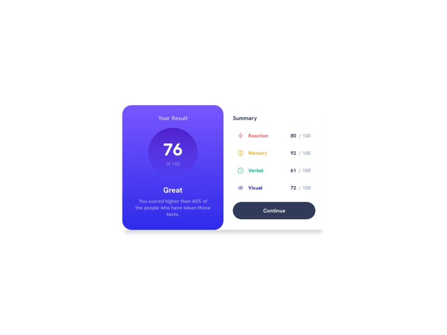
Design comparison
Solution retrospective
Here is my finished project. Any type of feedback would be immensely appreciated. I feel like there's a huge room for improvement.
Also, I can't figure out how to place attribution tag properly in mobile view. I meant for it to just stick to the bottom but it looks odd when i scroll
Community feedback
- @0xabdulkhaliqPosted over 1 year ago
Hello there 👋. Congratulations on successfully completing the challenge! 🎉
- I have other recommendations regarding your code that I believe will be of great interest to you.
CSS 🎨:
- Let me explain, How you can easily center the component for better layout without usage of
absolutepositioning.
- We don't need to use
absoluteto center the component both horizontally & vertically. Because usingabsolutewill not dynamical centers our component at all states
- To properly center the component in the page, you should use
FlexboxorGridlayout. You can read more about centering in CSS here 📚.
- For this demonstration we use css
Gridto center the component
body { min-height: 100vh; display: grid; place-items: center; }- Now remove these styles, after removing you can able to see the changes
@media screen and (min-width: 500px) {
  .grid {
    position: absolute;
    top: 50%;
    left: 50%;
    transform: translate(-50%, -50%);
  }
}
- Now your component has been properly centered.
.
I hope you find this helpful 😄 Above all, the solution you submitted is great !
Happy coding!
Marked as helpful0@ani-menaphirePosted over 1 year ago@0xAbdulKhalid tysm it worked just fine, it did create unnecessary space on top in mobile view though so I think I'll only put those properties for display view.
0
Please log in to post a comment
Log in with GitHubJoin our Discord community
Join thousands of Frontend Mentor community members taking the challenges, sharing resources, helping each other, and chatting about all things front-end!
Join our Discord
