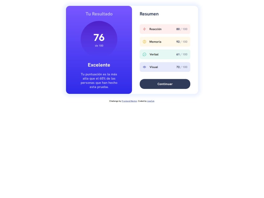
Results Summary Component using CSS, flexbox and media query
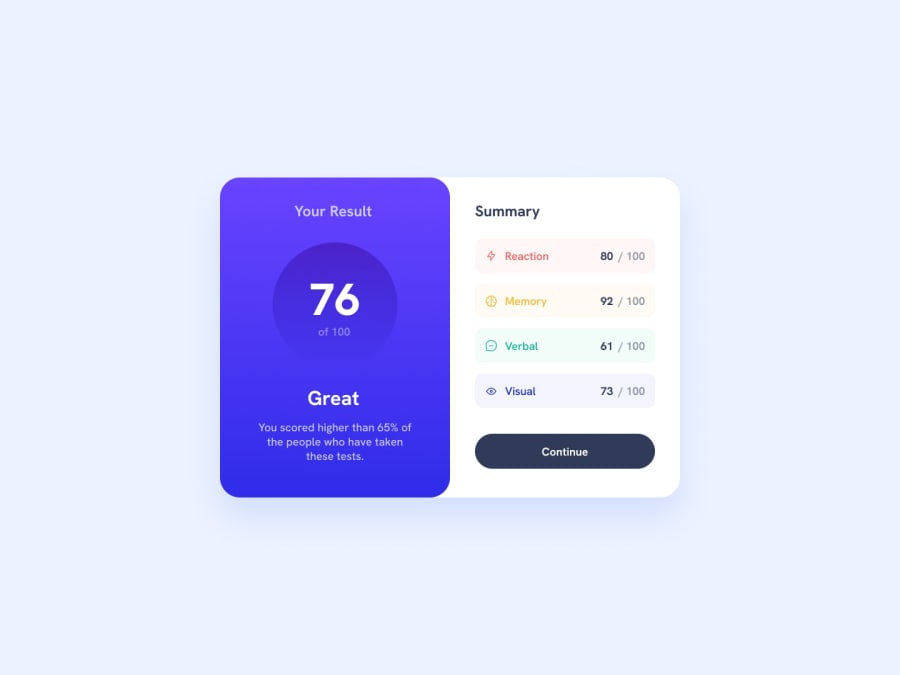
Design comparison
Solution retrospective
This is my solution for this exercise. I had some problems with the active button's color. Please give me your feedback, advice or anything to improve my skills. Thank you so much. :)
Community feedback
- P@danielmrz-devPosted about 1 year ago
Hello @LipeCat!
Your project looks great!
I noticed that you used
marginto place the card in the middle of the page. Here's a very efficient (and better) way to center the card (both vertically and horizontally):- Apply this to the body (in order to work properly, don't use position or margins):
body {
    min-height: 100vh;
    display: flex;
    justify-content: center;
    align-items: center;
}
I hope it helps!
Other than that, great job!
Marked as helpful0@LipeCatPosted about 1 year agoHello @danielmrz-dev!
Thank you so much for your feedback. I'll keep in mind your advice. :)
1
Please log in to post a comment
Log in with GitHubJoin our Discord community
Join thousands of Frontend Mentor community members taking the challenges, sharing resources, helping each other, and chatting about all things front-end!
Join our Discord
