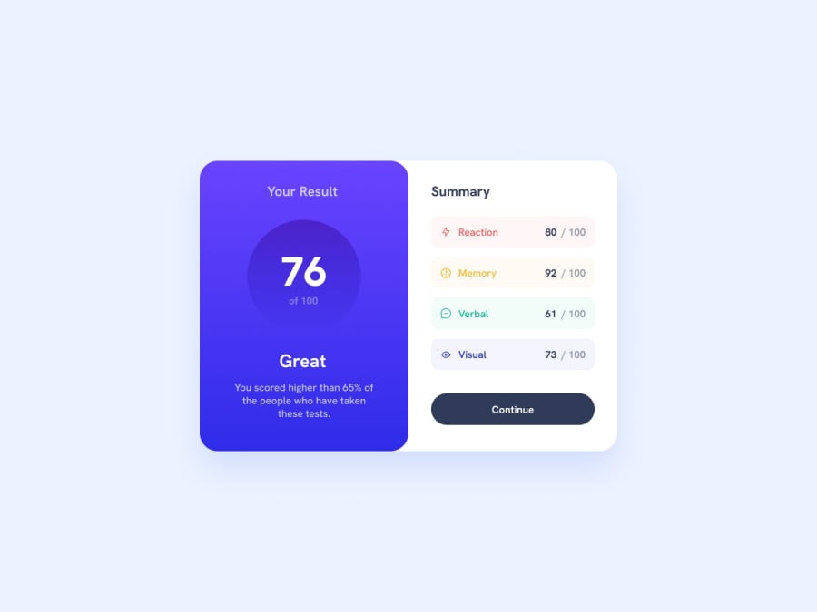
Design comparison
Solution retrospective
how to style small details faster instead of using many span
Community feedback
- @francescomerighi1202Posted over 1 year ago
1 - Your solution doesn't seem responsive :( Hint: try adding a media query (@media) and inside it change the direction of your flex-container (flex-direction property).
2 - Why did you use all those <span> tags? You could easily have used more appropriate tags like <div>, <p>, etc...
3 - Regarding the style, the gradient of the left part (including the circle) is not correct.
Regardless, the solution you posted is a good one.
In any case, feel free to check out my solution if it helps you.
P.S. If you found this comment useful, please mark it :)
Marked as helpful0
Please log in to post a comment
Log in with GitHubJoin our Discord community
Join thousands of Frontend Mentor community members taking the challenges, sharing resources, helping each other, and chatting about all things front-end!
Join our Discord
