Submitted over 1 year ago
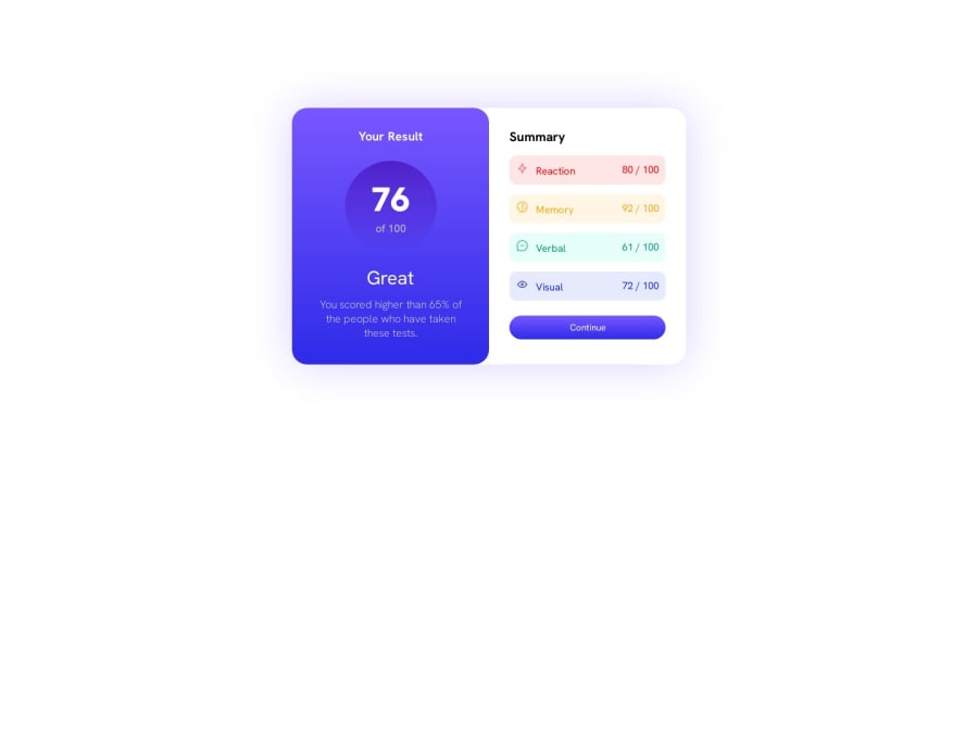
Results summary component solved With Simple HTML & CSS
@CodageWithRahul
Design comparison
SolutionDesign
Solution retrospective
Results summary component solved With Simple HTML & CSS
Community feedback
- @adityaphasuPosted over 1 year ago
Hi @CodageWithRahul!
Instead of giving the
.main-containeran explicit height likeheight: 695px;you should change it tomin-height:100vhlike this:.main-container{ min-height:100vh; //this height: 695px; //no need for this }- Reason why we use
min-height:100vhis because it will always take up the full height of the viewport, which helps prevent content from getting cut off and since we have flex properties on the container as well it will always be in the center.It also will adapt better to different screen sizes and orientations.
Some more suggestions based on your code:
- Instead of using
divfor.main-containerto represent the whole content on the page try using a more semantic tag like<main>which tells the search engines and assistive technologies that the content inside it is the main content of the page. - Instead of using
pxfor font size which is an absolute unit try usingremwhich is a relative unit and scales well with layouts. (In your casefont-size:19pxwould turn roughly intofont-size: 1.1875rem). Give this a read and you will understand a lot better.
Apart from some minor tweaks, the design looks absolutely amazing good job!
Keep up the hard work and good luck!🙌🏻
0 - Reason why we use
Please log in to post a comment
Log in with GitHubJoin our Discord community
Join thousands of Frontend Mentor community members taking the challenges, sharing resources, helping each other, and chatting about all things front-end!
Join our Discord
