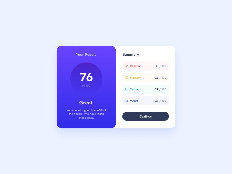
Results summary component solution using CSS FlexBox
Design comparison
Solution retrospective
I struggled with the CSS properties but with researching and going through some previous codes that I wrote, finally managed to do the gradients and all the background colors.
I still have to practice/work on Flexbox as my knowledge needs sinking in:)
What challenges did you encounter, and how did you overcome them?Flexbox and styling as well as media query sections were challenging but with patience and research I made it happen.
What specific areas of your project would you like help with?I'd like to know if there was a simpler way to write the CSS as I sometimes felt it took longer than I expected.
I love constructive feedback!
Community feedback
- @yefreescodingPosted 9 months ago
Perfect, now I can see what you've done 😁.
You did a pretty good job, and I really like how you build and organize your HTML file.
- One tip is that you should use more semantic HTML tags for your components, such as
<main>,<section>,<header>,<footer>, etc. There are semantic HTML tags for almost any use case. Remember that<div>means division and shouldn't be used for everything.
Your styles are great as well, just a couple of things:
- The
<div class="your-result column-1">does not have theborder-radius: 20px; you applied it to the parent container<div class="flex-box"/>. Take a look at the original design, and you will see how the border is curved on the left side.
The last thing I've noticed is your table on the left side, where you decided to put the data:
- Use these properties:
display: flex;,flex-direction: column;, andgap: 16px;. These will help you control the components inside your<tbody>element using flex. - You can also use the same property,
display: flex;, on the<tr class="reaction-background"/>elements. The flex property, combined withjustify-content: space-between;, can fix the position of the data inside the<tr class="reaction-background"/>.
Overall, you're doing a great job so far. Keep practicing; you're on the right path. I hope this helps you improve. If you need anything, feel free to ask me.
Marked as helpful0 - One tip is that you should use more semantic HTML tags for your components, such as
- @yefreescodingPosted 9 months ago
It appears that there’s an issue with the live site. The CSS stylesheet might not be linked correctly, as there is no styling applied. You should check this.
Marked as helpful0@JJ-codes-9Posted 9 months agothank you for letting me know, it was working yesterday, I'll look into it @yefreescoding
1@JJ-codes-9Posted 9 months agojust commited the update, Github always confuses me with the paths and image sources, there always seems like I need to add a period even though I work on VS code and check the site with live extension before committing. @yefreescoding
1
Please log in to post a comment
Log in with GitHubJoin our Discord community
Join thousands of Frontend Mentor community members taking the challenges, sharing resources, helping each other, and chatting about all things front-end!
Join our Discord
