Submitted 12 months ago
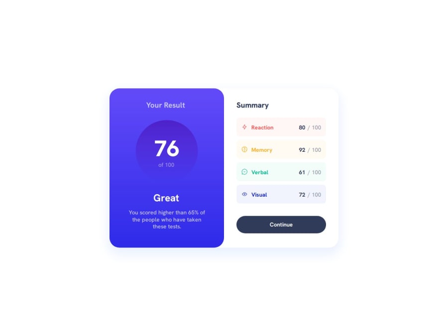
Results Summary Component Solution [HTML, CSS, Mobile First]
#accessibility

@faruqAbdulHakim

Design comparison
SolutionDesign

Solution retrospective
Feel free to give your suggestions and feedback. 😃
Community feedback
Please log in to post a comment
Log in with GitHub
Join our Discord community
Join thousands of Frontend Mentor community members taking the challenges, sharing resources, helping each other, and chatting about all things front-end!
Join our Discord