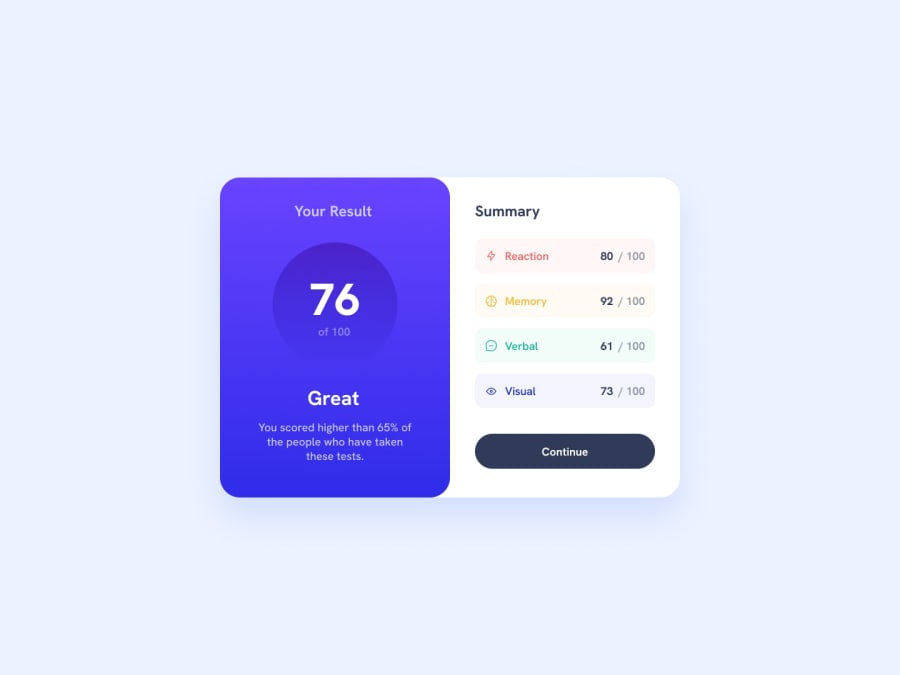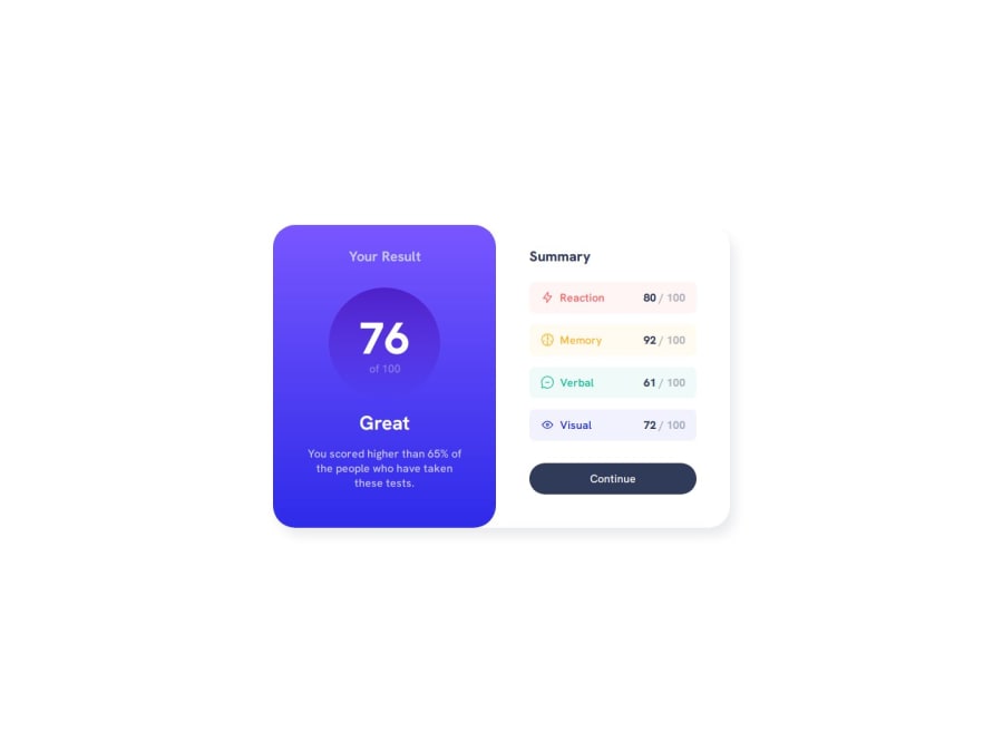
Results summary component solution, features CSS flexbox
Design comparison
Solution retrospective
Hello everyone,
This is my version of results summary component, fully responsive using flexbox and custom properties ๐. I hope you like it๐. Your feedback and suggestions are greatly appreciated ๐
Community feedback
- @petritnurediniPosted 9 months ago
Firstly, congratulations on completing your Frontend Mentor project! It's a great achievement to build a project from the ground up, and your dedication is evident in your work. Here are some best practices and recommendations to enhance your project:
HTML & CSS Best Practices:
- Use of Semantic HTML: It's great to see you using semantic elements like
<main>
and<section>
. This helps with the readability and accessibility of your HTML. - Responsive Design: Your use of media queries for responsiveness is commendable. Always ensure your website looks good and functions well on all devices.
- CSS Variables: Excellent job using CSS variables for color management. This makes your stylesheet more maintainable and easier to update.
- Alt Text for Images: Don't forget to add descriptive alt text to your images. This is important for accessibility, as it describes the image to users who rely on screen readers.
Performance:
- Optimize Images: Ensure that images are optimized for the web. This helps in reducing the page load time, especially for users on slower internet connections.
- Minimize CSS Selectors: While your CSS is well-organized, try to minimize the use of deep selectors to improve performance and maintainability.
Code Readability and Organization:
- Consistency in Naming: Ensure consistency in your CSS class naming. It's good practice to stick to a specific naming convention like BEM (Block Element Modifier) for easier understanding and maintenance.
- Commenting: Adding comments to both your HTML and CSS can aid in understanding the structure and purpose of various sections, especially in larger projects.
Accessibility:
- Keyboard Accessibility: Ensure that all interactive elements like buttons are accessible via the keyboard. This is important for users who rely on keyboard navigation.
- Contrast Ratios: Check that the text colors and background colors have enough contrast to be easily readable, especially for users with visual impairments.
Learning Resources:
- To learn more about semantic HTML, MDN Web Docs is an excellent resource.
- For CSS best practices, CSS-Tricks is a great place to start.
- To ensure your site is accessible, WebAIM offers guidelines and tools.
Keep up the fantastic work! Remember, each project you complete is a step forward in your web development journey. Your progress is impressive, and by continuing to apply best practices, your skills will only get stronger. Keep pushing forward!
0 - Use of Semantic HTML: It's great to see you using semantic elements like
Please log in to post a comment
Log in with GitHubJoin our Discord community
Join thousands of Frontend Mentor community members taking the challenges, sharing resources, helping each other, and chatting about all things front-end!
Join our Discord